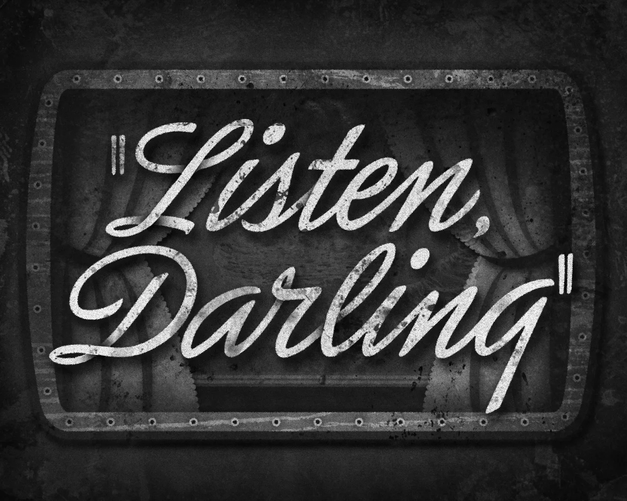
Here’s the title card I’ve designed and lettered for the next film in Judy Garland’s filmography, Life Begins for Andy Hardy, where Andy (played by Mickey Rooney) weighs post-graduation options—college or a New York job?—while tempted by a Manhattan “wolfess” and championed by the ever faithful Betsy Booth (played by Judy Garland).
I decided to reference the main title sans serif and to create a deco-inspired necktie pattern for the background.
It’s the third and final Andy Hardy movie that Judy plays a part in and it is also the darkest Andy Hardy film to ever be released. It was quite controversial as there is a pal of Andy’s who commits suicide (which was later changed to a heart attack due to the Production Code censors) and the Catholic Legion of Decency slapped an “objectionable for children” rating on the film because of its mature themes and Andy’s affair with a married temptress.
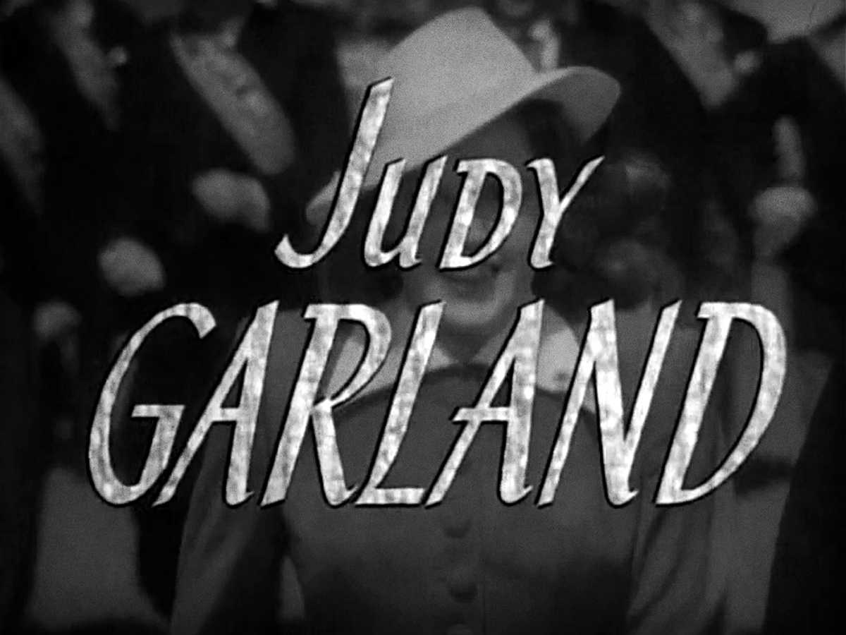
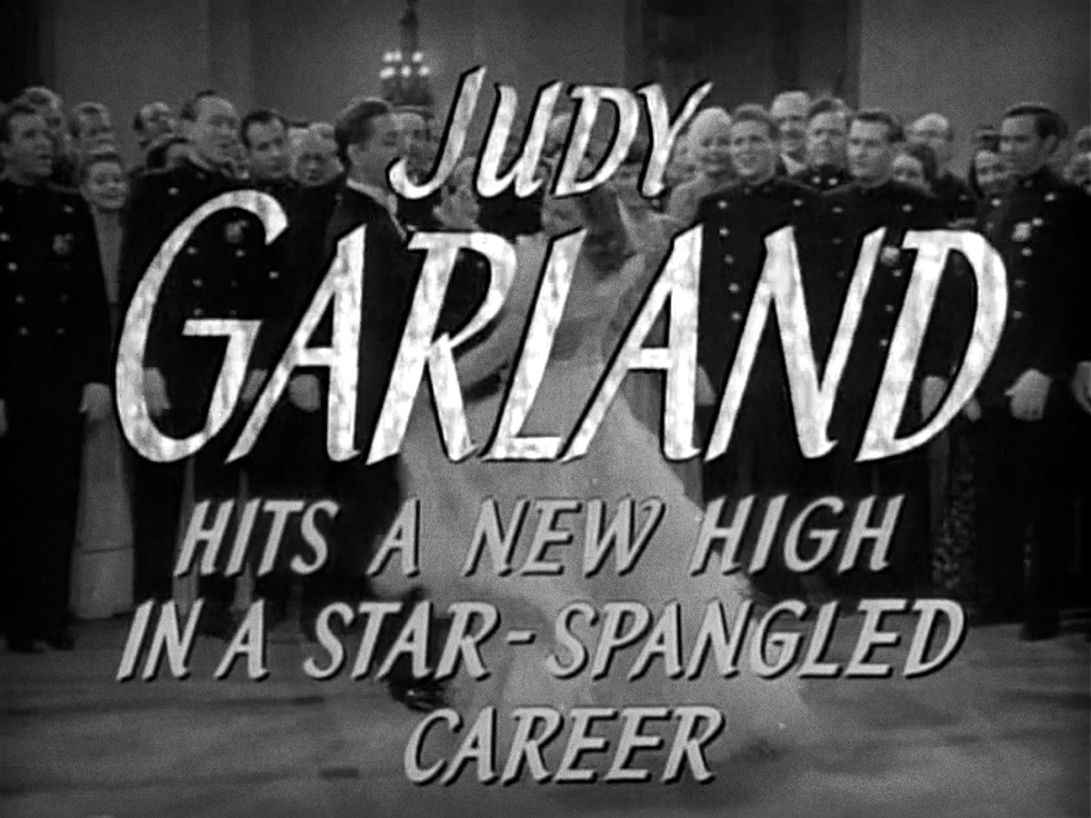
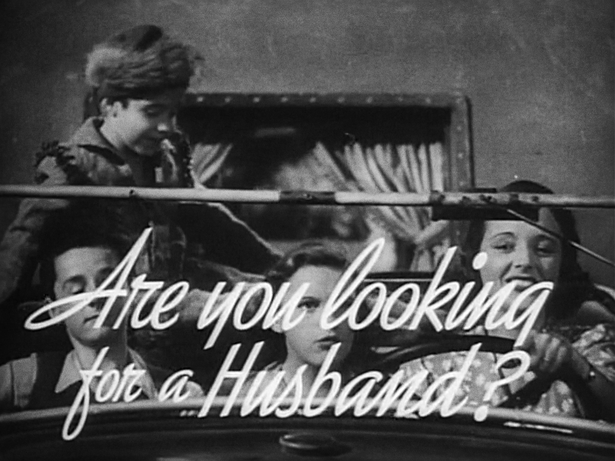
The typography in the trailer is a bold sans serif which I’m noticing is a very common choice in 1941.
Luckily, the main titles are more interesting using a sans serif with varying widths and a script “L.” The MGM lion backdrop was used in many films that a backdrop was not designed. The film was nothing to be taken lightly as Andy Hardy played by Mickey Rooney was a huge commodity and a box office smash. It’s very surprising that the main titles were not more elaborate. The script that accompanies the sans serif is very beautiful though!
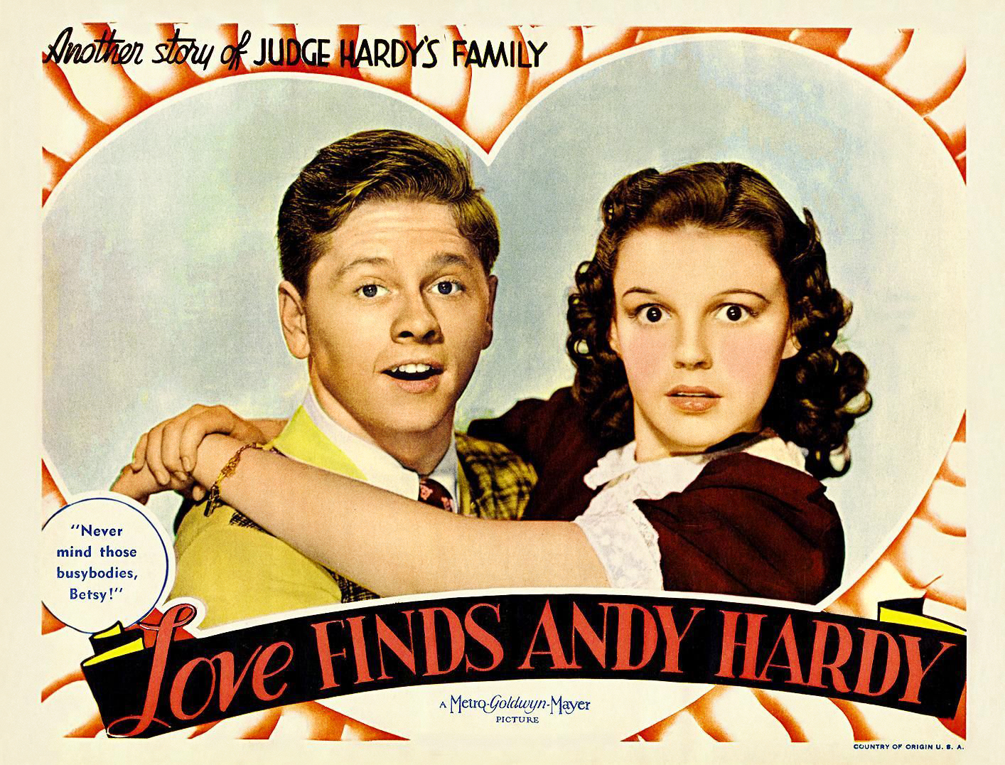
Here are a few posters that have a fun deco sans serif that is different than anything else used in the promotional materials. I also love the magazine ad below them that features an iconic illustration of the stars by Al Hirschfeld. The script lettering is nice as well!
Here’s the theatrical trailer for the film!


