A Star Is Adorned

In addition to being nominated as one of Print Magazine's 15 under 30 creatives, I was also interviewed for the following feature about my Judy Garland film title project.

For creatives who spend their day jobs designing and crafting for clients, the after-hours struggle to develop fulfilling personal projects is very real. Raphael Geroni, a New York City–based designer with Louise Fili Ltd., understands this all too well.

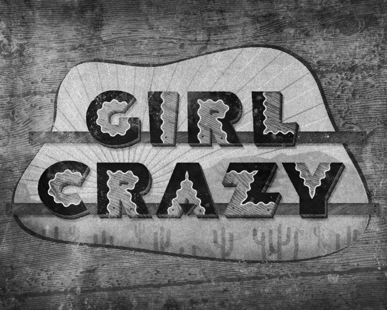
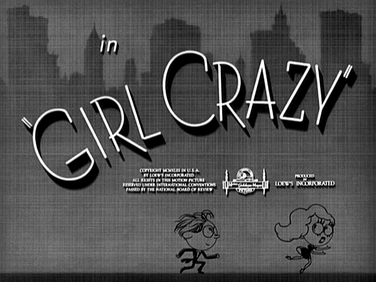
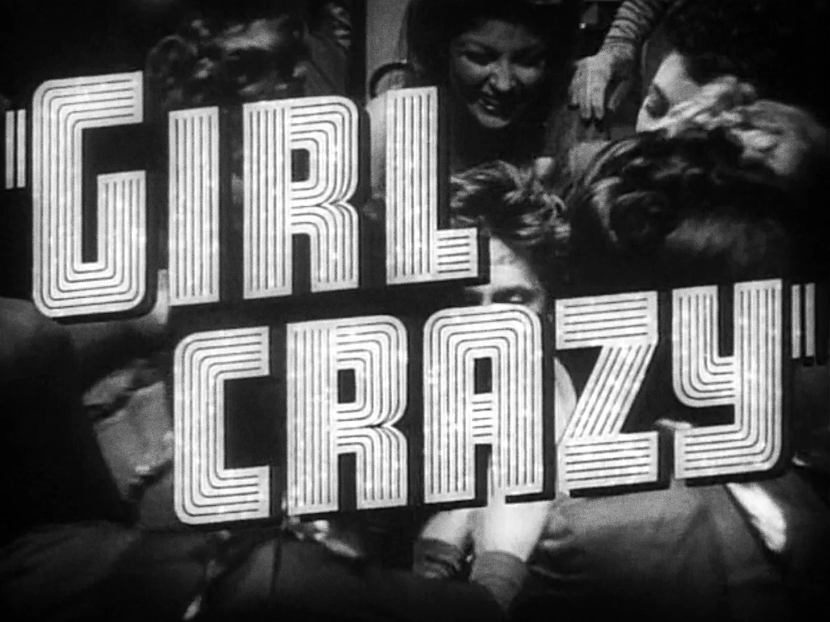
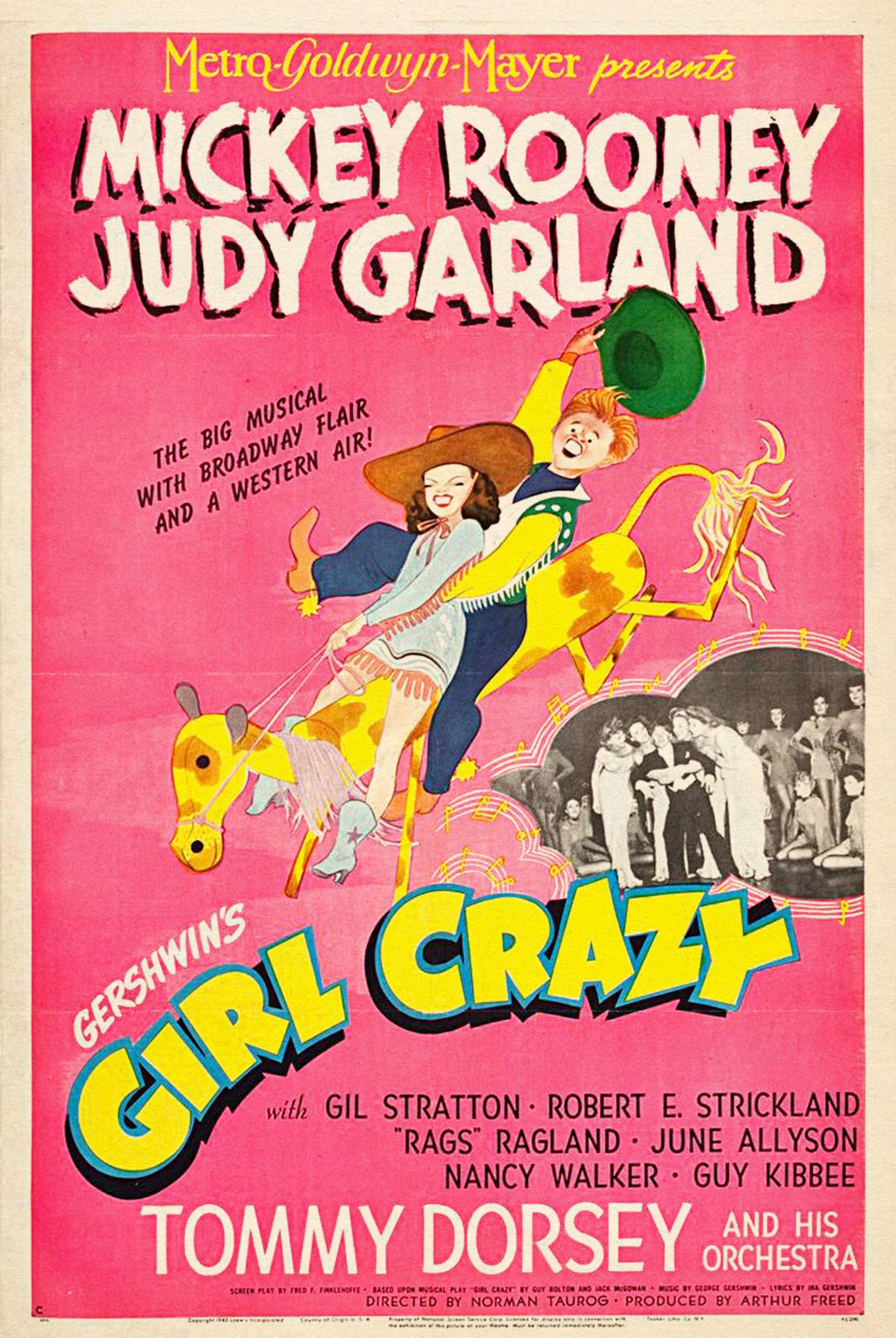
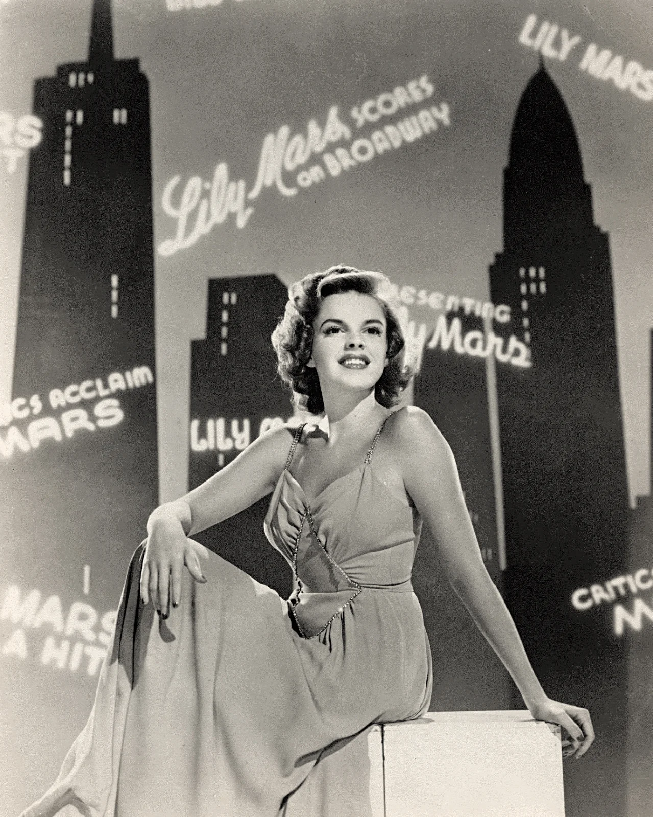
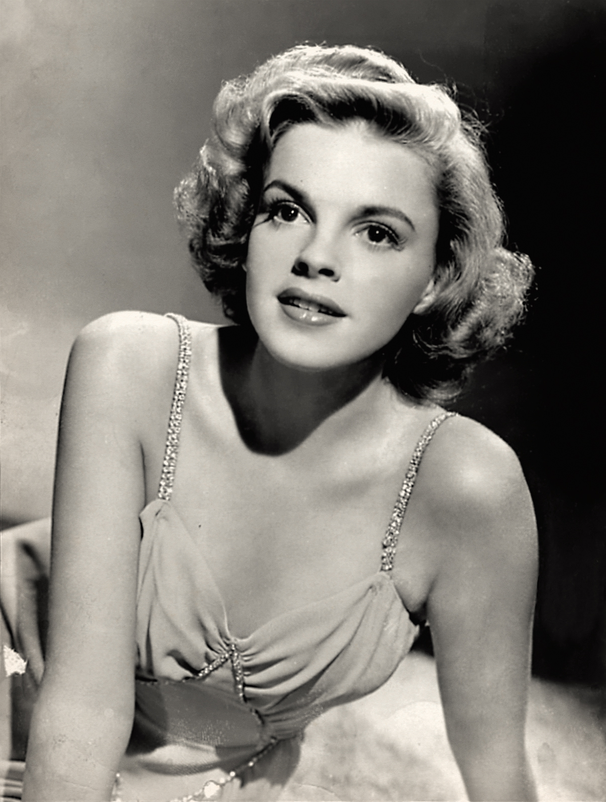
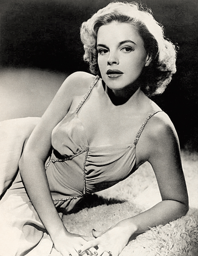
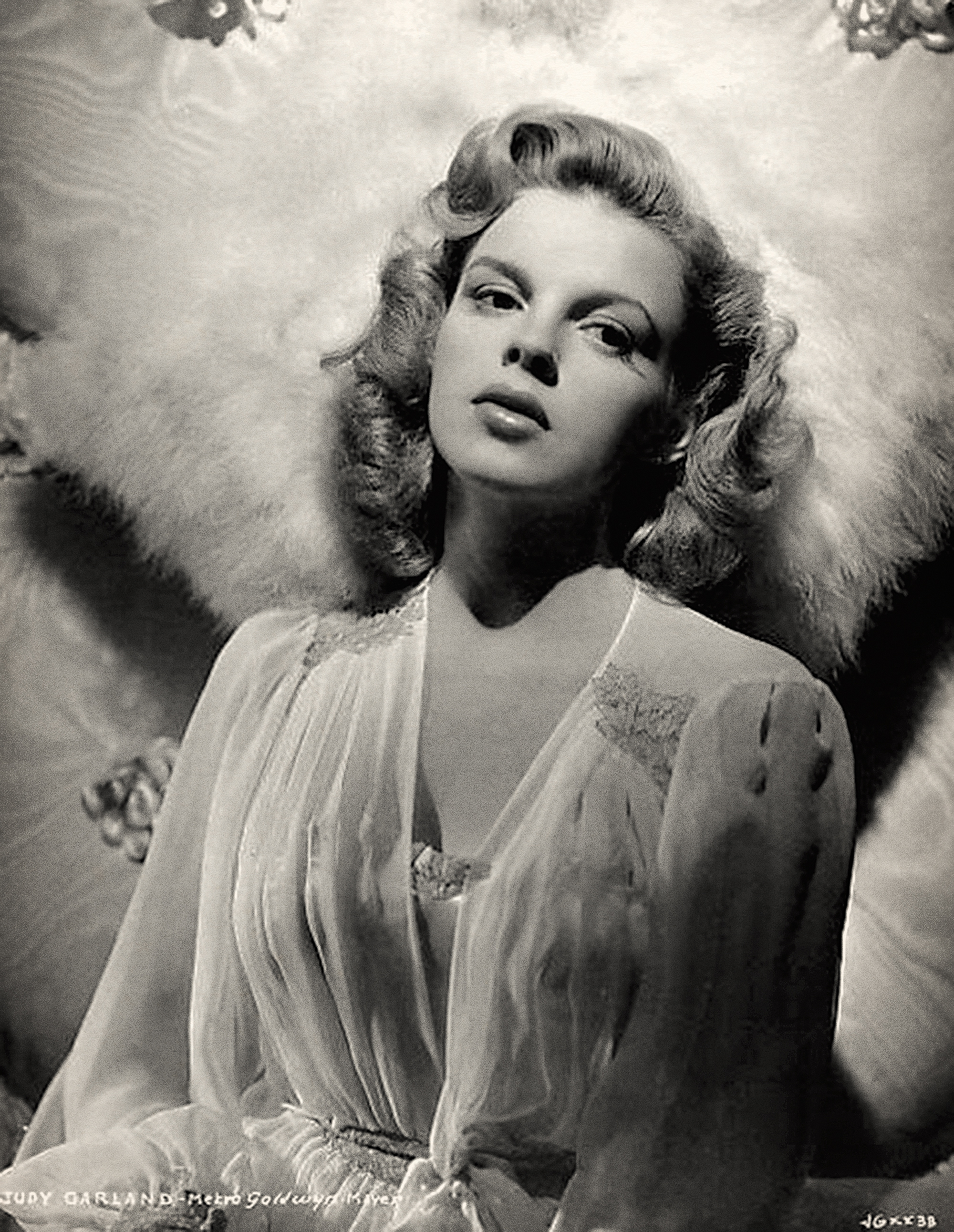
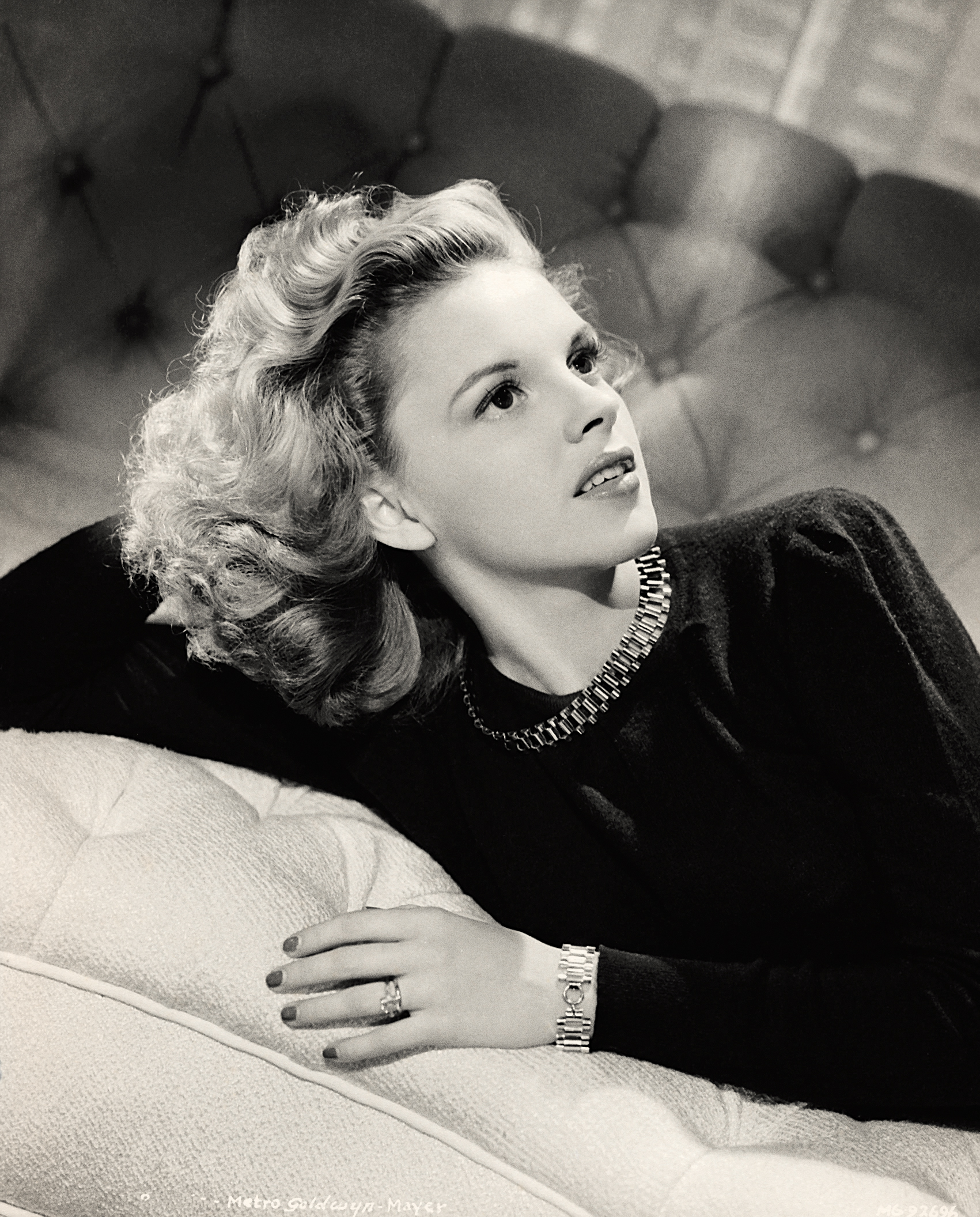
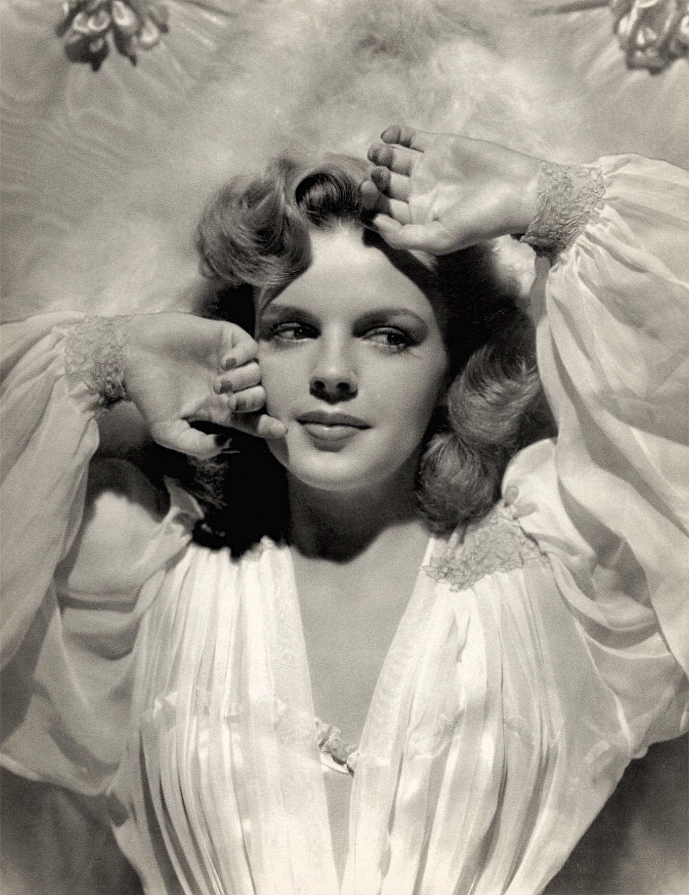
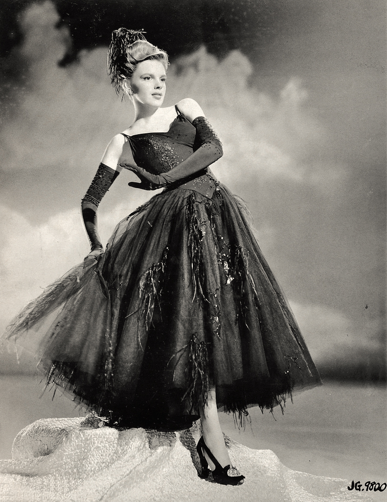
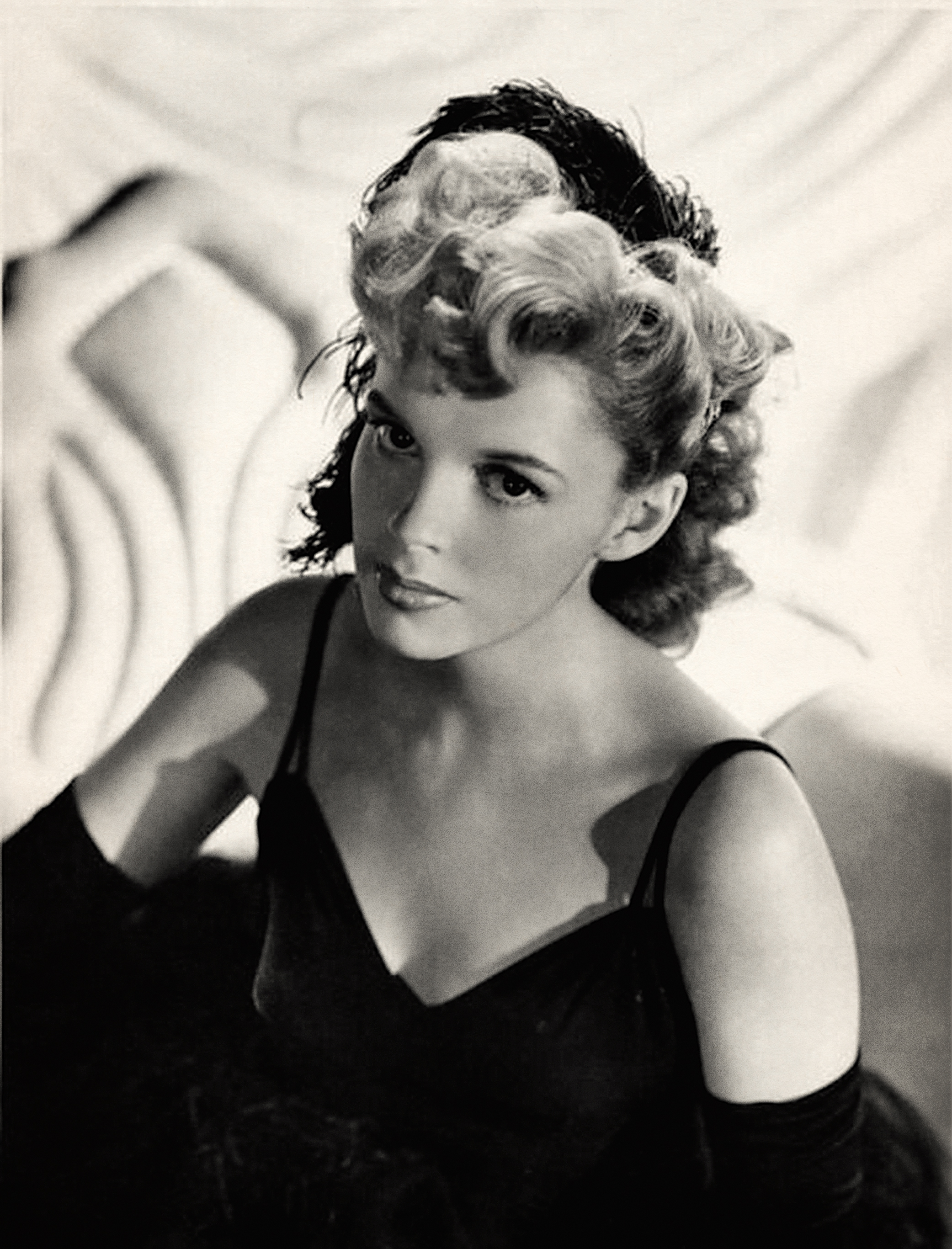
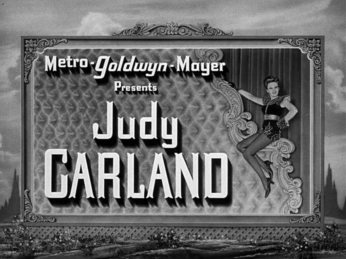
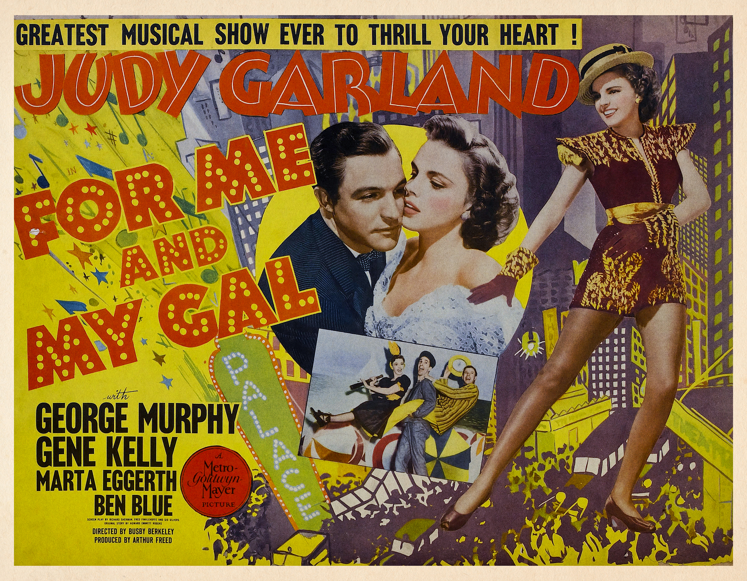
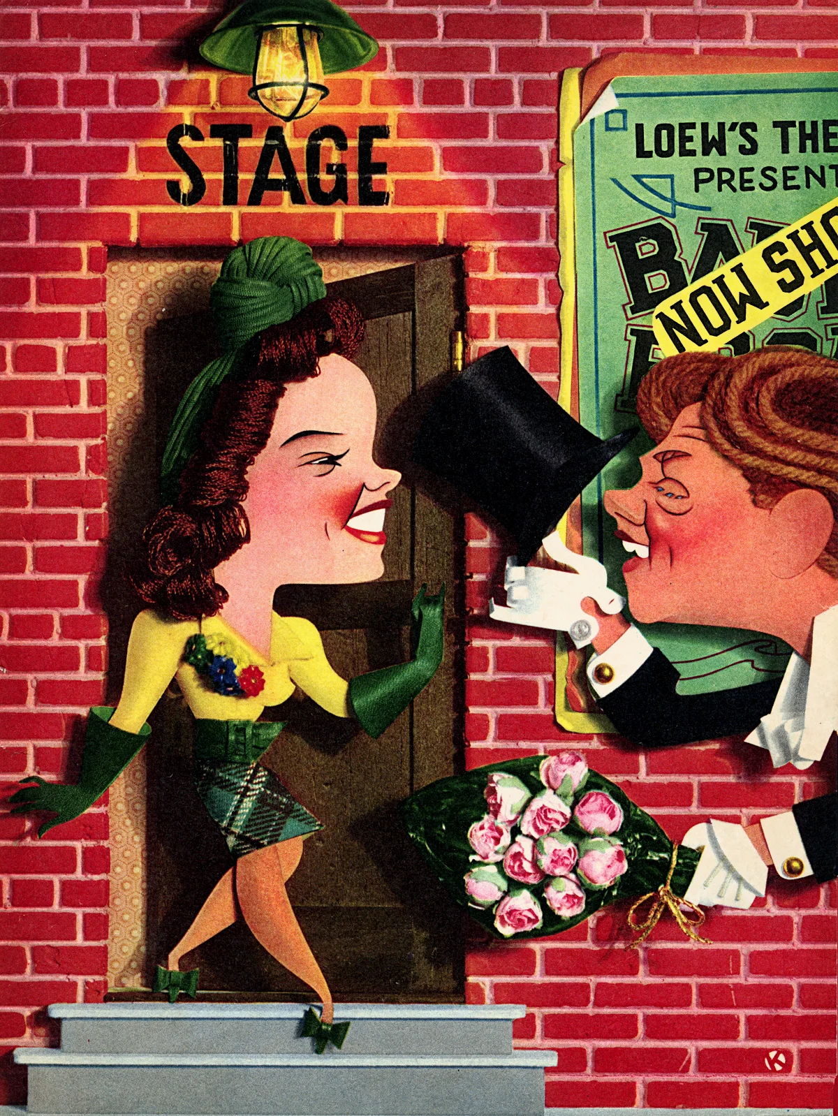
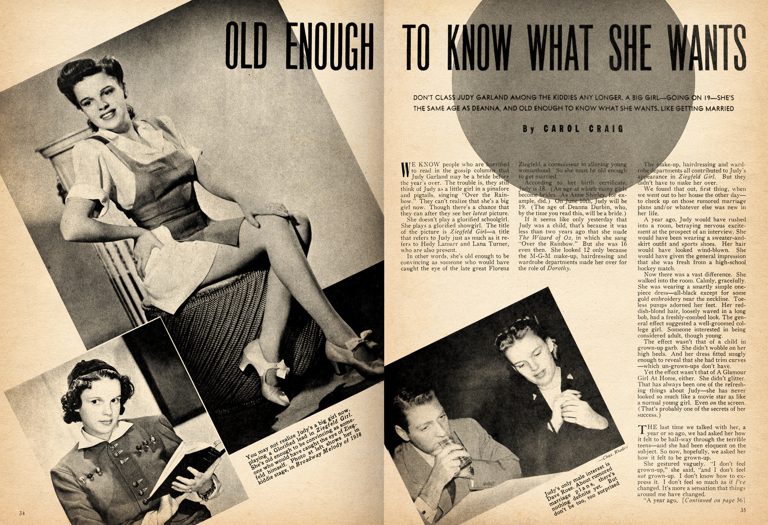
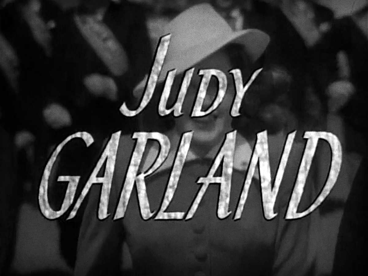
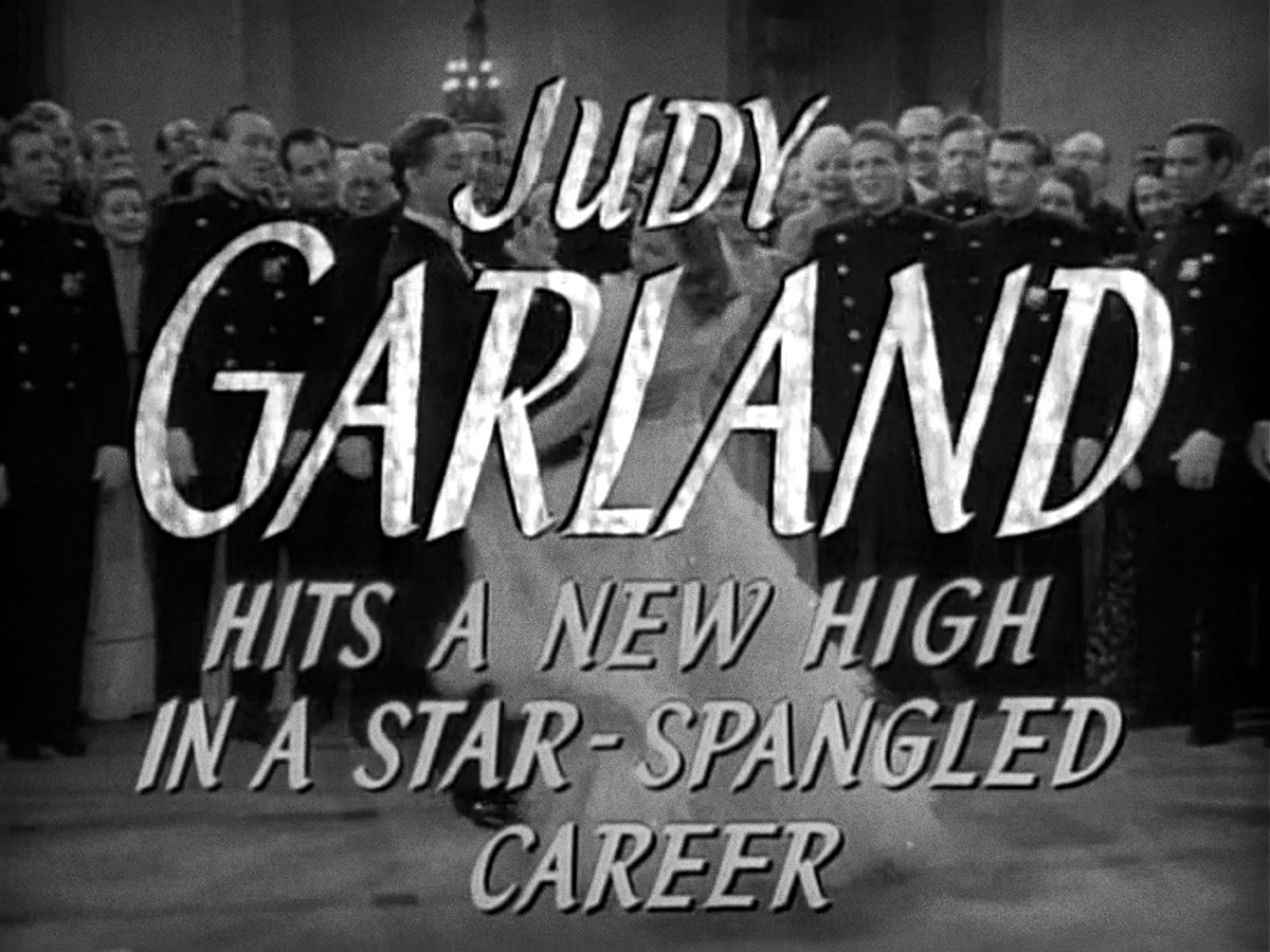
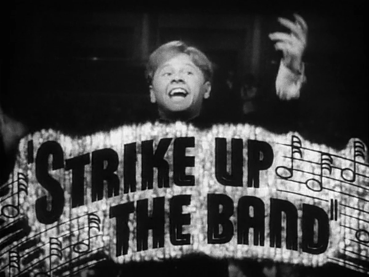
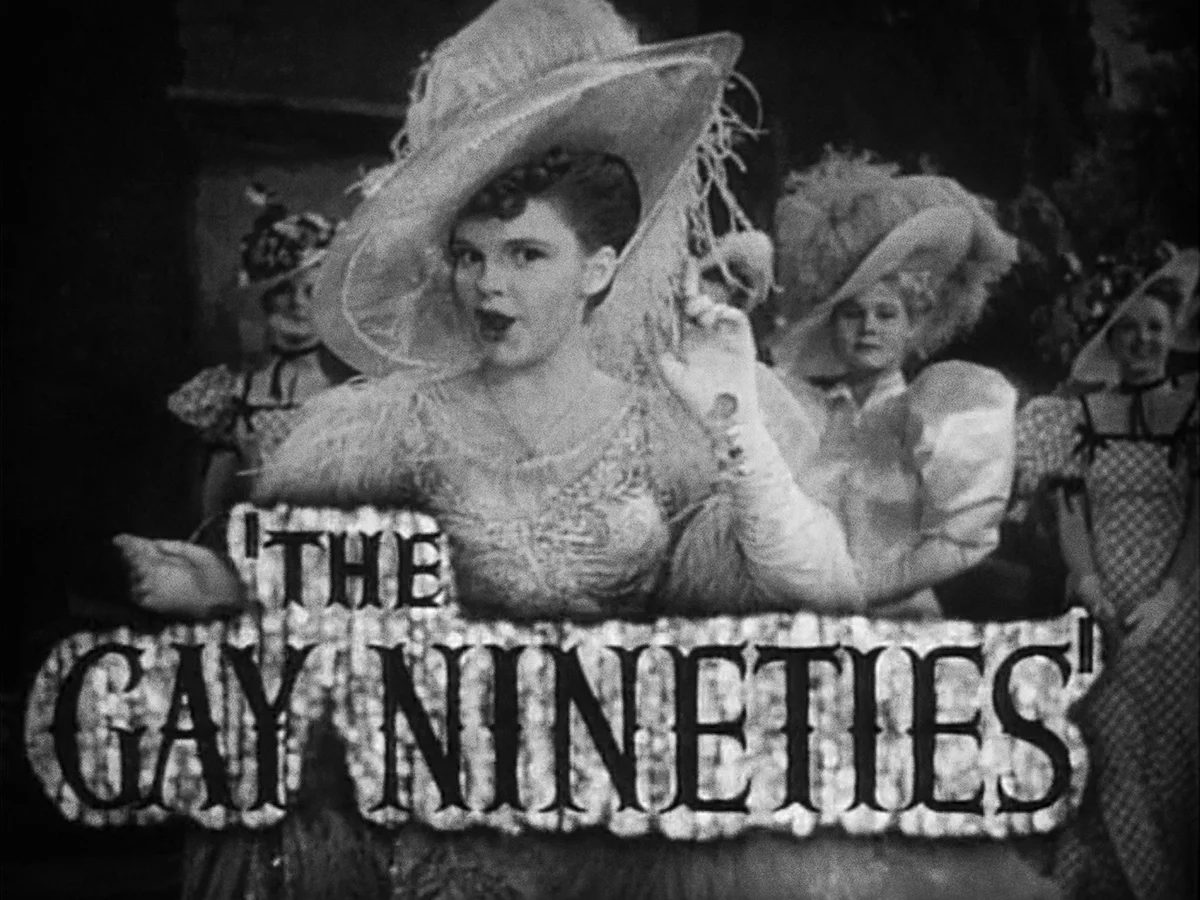
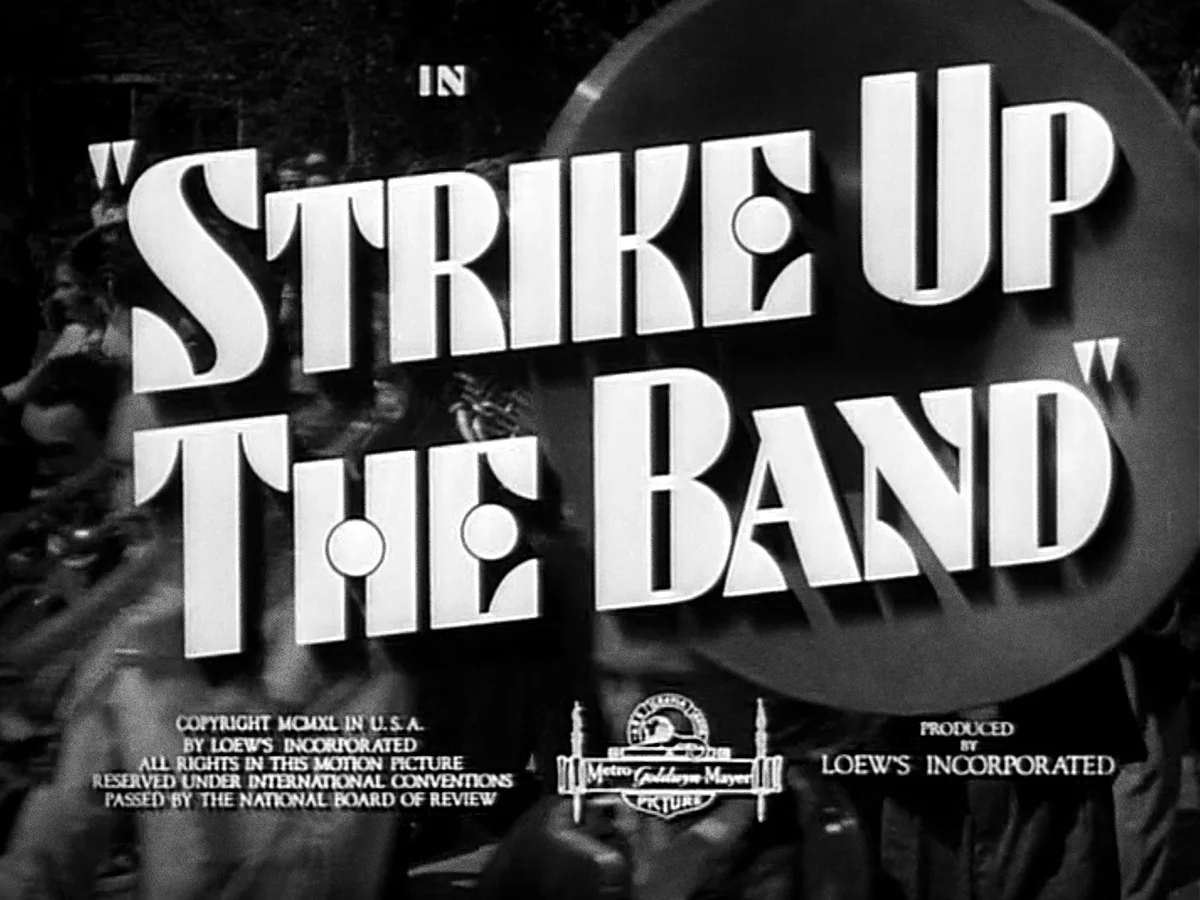
That’s why he used The Judy Garland Film Title Project to turn his passion for classic films into an initiative celebrating his favorite actress. Drawing inspiration from the original titles and promotional ephemera from Garland’s films, Geroni designed and lettered retro title cards using historical typography, deep research and Art Deco style to inform his black and-white pieces.

“I wanted to develop a project that I was passionate about, that involved my personal interests and that I could share with fans of Garland, historical typography and Hollywood history,” Geroni says. “I thought a great deal about how special title designs are to fans, and about their increased importance because they literally flash before your eyes. Before home video and the internet, the titles could only exist for fans in the form of their memories, and revisiting long out-of-print films could be incredibly difficult.”

Geroni wanted to pay homage to this by documenting and presenting a cohesive visual representation of Garland’s filmography on his website (www.raphaelgeroni.com), beginning with her most popular movies, and later working chronologically.

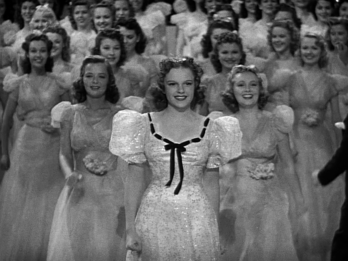
While the 34-title project progressed three title cards at a time, Geroni’s appreciation for Garland’s talents began as a child when he became enchanted with The Wizard of Oz.

“It was the coolest thing I’d ever seen. I was enamored with the artfulness of that movie,” he says, noting that it wasn’t until much later that he discovered the full extent of Garland’s career.
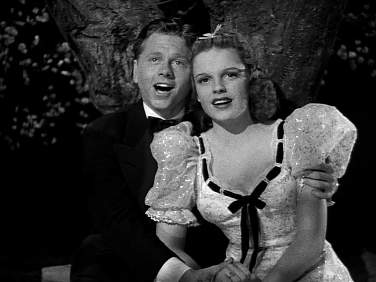
A Star is Born is my all-time favorite movie and one of the greatest films ever made, even though it was snubbed during awards season. Another one of my favorites is The Pirate, although it’s not widely loved because it was intentionally campy before camp was cool.”

Geroni’s love for Garland successfully translates to the project. In addition to ensuring the pieces matched the 4:3 aspect ratio of the majority of the films, Geroni wrote detailed blog posts about each film and title card and snuck in visual Easter eggs for other movie buff s to appreciate.

“The typeface I used for the captions under each card is set in a font called Meyer Two—an intentional misspelling of [film producer] Louis B. Mayer’s last name—which was one of five fonts that Linotype cut to Mayer’s personal specifications to be used at MGM in their film titles and silent film subtitles. It was drawn in 1926 and digitally revived by David Berlow in 1994.” The completed project is printed on metallic stock at the one-sheet poster size of 27-by-41 inches, enhancing its filmic quality. Geroni says the ultimate goal of the production is to “remind you of a vintage silver gelatin portrait you might have received after writing to your favorite MGM star.”

The poster is currently available for purchase here.

The rejected designs for “A Star is Born”


ASIB_SB_SketchComp-COMP.jpg

In September 1950, Judy Garland was let go from her alma mater, M-G-M, for being “unreliable” at twenty-eight years old. She had completed twenty-seven films for them by that time and to much of the motion picture world she was considered “finished.”

Shortly after being let go and her very last M-G-M film Summer Stock had been released to great acclaim, she and a man named Sid Luft met in New York City. By this time, she had survived a suicide attempt, a subsequent nervous breakdown, and a divorce from her second husband, director Vincente Minnelli.

Luft picked up where M-G-M had left off and set up a series of concerts for her in England, beginning at the London Palladium. The success of these performances led to an offer for her to bring vaudeville back to New York City by opening her show at the legendary RKO Palace Theatre on Broadway, which hadn’t seen a live performance in almost twenty years.

Garland opened her show on Broadway on October 16, 1951, to tremendous critical and public acclaim. Her star was on the rise again and getting back into the movies was the next step to secure her place in the industry.

Luft acquired rights to the story of A Star is Born and produced it with Warner Bros. as a musical remake of the classic 1937 film starring Janet Gaynor and Fredric March. The talent he and Garland secured to create this epic masterpiece included James Mason as her co-star, the screenplay writer Moss Hart (Lady in the Dark, 1941), composer Harold Arlen (“A Sleepin' Bee,” “Come Rain or Come Shine,” “Get Happy,” and “Over The Rainbow”), lyricist Ira Gershwin (Every classic song you can think of. Perhaps you have heard of his brother George?), and director George Cukor (What Price Hollywood?, 1932, Gaslight, 1944, My Fair Lady, 1964). George Cukor had crossed paths professionally with Garland before! After he was fired from Gone With the Wind, he spent a week directing tests for The Wizard of Oz and his main contribution was changing Garland’s appearance as Dorothy by discarding her blonde wig and getting the makeup department to give her a more natural look with simply braided auburn hair.


The film premiered on the evening of September 29, 1954 at the RKO Pantages Theatre in Hollywood, California. The event was the first of its kind to be telecast nationally. Everyone who was anyone in Hollywood was in attendance for this incredible evening and included stars like: Dean Martin, Elizabeth Taylor, Liberace (along with his doting mother), Debbie Reynolds, Kim Novak, Peggy Lee, Ray Bolger, Sophie Tucker, George Jessel, Joan Crawford, Doris Day, Jack L. Warner, Lauren Bacall, Janet Leigh, Lucille Ball, and Desi Arnaz.


Below is the final one-sheet poster used for promotion of the film:

FinalASIBPoster.jpg

The talent that I  mentioned above have been discussed for decades but one person that I admire in my own field of graphic design who was also involved in this film in a very brief capacity is the incredible Saul Bass. Yes, the same Saul Bass who was a graphic designer and Academy Award winning filmmaker, best known for his design of motion picture title sequences, film posters, and corporate logos.

During his forty-year career Bass worked for some of Hollywood's most prominent filmmakers, including Alfred Hitchcock, Otto Preminger, Stanley Kubrick and Martin Scorsese.

The following images  are just a few of his many iconic pieces of work:


Al Kallis is an illustrator who became known for his iconic movie poster illustrations below:


The sketches below were released in an article on TVweek.com by Chuck Ross who had been given access to illustrator Kallis’ photographs of freelance illustration work that were completed in the 1950s. He worked with Bass on a number of projects and it is fascinating to see what could have been.

In his 2015 memoir, “Living the Gift of Time,” Kallis says, “My most interesting client was the gifted designer Saul Bass. Early in his career Saul was primarily involved with motion picture advertising. I made rough layout art based on his ideas and also created finished art.”

My favorite is the one that creates a star-shaped logo made of the title type.

ASIB_SB_SketchComp-1.jpg
ASIB_SB_SketchComp-2.jpg
ASIB_SB_SketchComp-3.jpg
ASIB_SB_SketchComp-4.jpg
ASIB_SB_SketchComp-5.jpg
ASIB_SB_SketchComp-6.jpg

The illustration of Garland in a straw hat used in many of Kallis’ sketches references the following musical number that was cut from the final film. Perhaps it may have been a contributing factor to their rejection?


I own a few of the pre-recording acetates containing the songs from the film (with Garland’s vocals and Ray Heindorf’s orchestrations) and I have included a special version of one of my favorite numbers from the film: “Someone at Last” which is the number that provided the image above that was referenced in the final promotional materials for the film.  The song is a parody of musical production numbers (with subtle Gershwin lyrics to set the sub-text of Garland’s character’s emotional longing) that she performs to cheer up Mason’s character using props lying around in their super-modern home. This version is without the dialog from the film, without the dramatic choir, and features a powerhouse vocal ending that wasn’t used in the final film.

The label refers to the song as a “Tour de Force” and it certainly is!

ASIB Acetate 1.jpg
ASIB Acetate 2.jpg

RGeroni_FilmsOfJudyGarland_29_AStarIsBorn.jpg

If you haven’t already checked out my film title project please follow the link below.

Girl Crazy • 1943


�RGeroni_GC_1943FINAL

Here’s the title card I’ve created for the next film in Judy Garland’s filmography, Girl Crazy, where Mickey Rooney plays an irresponsible young playboy who’s sent to a Western mining school where Judy Garland, as the dean’s daughter, helps straighten him out. Together they save the financially strapped college by staging a rodeo/beauty contest/musical extravaganza. Garland’s character, called Ginger Gray, was originally played onstage by Ginger Rogers.

It’s the ninth of ten movies Mickey Rooney and Judy appeared in together!

Girl Crazy was originally a George and Ira Gershwin stage show that MGM bought in 1939 to use as a follow-up vehicle for Fred Astaire and Eleanor Powell after the success of Broadway Melody of 1940. Judy’s mentor Roger Edens, who had to do some convincing, got Judy on board to star in the picture, instead, although she wanted to do more adult roles.

The New York Times said that “the immortal Mickey... is an entertainer to his fingertips. And with Judy, who sings and acts like an earthbound angel, to temper his brashness, well, they can do almost anything they wish, and we'll like it even in spite of ourselves.”

©RGeroni_GC_1943Titles1.jpg
©RGeroni_GC_1943Titles2.jpg
©RGeroni_GC_1943Titles3.jpg

The main titles are above and the bold trailer titles are below.

©RGeroni_GC_1943Trailer1.jpg
©RGeroni_GC_1943Trailer3.jpg
©RGeroni_GC_1943Trailer2.jpg
©RGeroni_GC_1943Trailer4.jpg

Here's a photo from the famous “Embraceable You” scene.

�RGeroni_GC_1943Photo3.jpg

Here’s a fun poster featuring an illustration by the iconic Al Hirshfeld.

©RGeroni_GC_1943Poster.jpg

Judy and Mickey reunited on her television show in 1963. It was a very lovely moment to see them together again singing the songs they made famous.

©RGeroni_GC_1943Photo.jpg
©RGeroni_GC_1943Photo2.jpg
©RGeroni_GC_1943Photo3.jpg

Here’s the theatrical trailer for the film:

Presenting Lily Mars • 1943


©RGeroni_PLM_1943Title_FINAL.jpg

Here’s the title card I’ve created for the next film in Judy Garland’s filmography, Presenting Lily Mars. In the movie, an Indiana teen makes good on Broadway (eventually) thanks to a producer (played by Van Heflin) from her hometown and despite his temperamental leading lady (played by European operetta star Marta Eggerth).

This piece was a hard one to tackle as it’s one of my absolute favorite Garland films and I wanted it to be something really special. I referenced “Presenting” from the main trailer typography but built it out of marquee lights, instead, and a drew an illuminated script for the rest of the title.

Judy was 19 when she filmed Presenting Lily Mars. Appearing as an adult for the very first time on screen at the end of the picture in the film's grand musical finale number, she was already a divorcee in real life. For the big number she was decked out in an adult evening gown and appeared wearing her hair up for the first time ever on screen.

MGM had intended that the film star Lana Turner but producer Joe Pasternak added musical numbers and thought it was better suited for Judy Garland.

At the time, MGM was working her mercilessly. She was finishing shooting For Me and My Gal, with Gene Kelly, as she started musical rehearsals for Presenting Lily Mars and would start musical numbers for her next film Girl Crazy, while completing the earlier picture.

Per usual, critics hailed her ability to sell a song and her effortless transitions from comic to dramatic scenes. If you only watch a few of her lesser known films, I would highly recommend you give this one a shot.

It’s one of my favorites because Judy has never looked more glamorous, beautiful, and healthy. Despite becoming a divorcee during filming, being over worked, and relying on medications to get through most days, she was a sincere professional which shines through in her heartfelt and heartwarming performance. Her voice is much more mature sounding here than in her “Oz” days which were just a few years prior. This iconic voice would only get stronger and stronger in the coming years.

The typography in the trailer is a super bold condensed sans serif that’s perfect for illuminating Broadway. I love the board showing the stars ranking at MGM. It’s a pretty fabulous list to be on.

©RGeroni_PLM_1943Trailer2.jpg
©RGeroni_PLM_1943Trailer3.jpg
©RGeroni_PLM_1943Trailer1.jpg
©RGeroni_PLM_1943Trailer4.jpg
©RGeroni_PLM_1943Trailer5.jpg

The main title sequence was illustrated by the very talented and iconic illustrator Jacques Kapralik who also created many print ads for the film as well as many other MGM classics I’ll be showing example of when we get there. The treatment features some lovely deco type that very closely resembles what was created for Babes on Broadway.

©RGeroni_PLM_1943Titles1.jpg
©RGeroni_PLM_1943Titles2.jpg
©RGeroni_PLM_1943Titles3.jpg
©RGeroni_PLM_1943Titles4.jpg
©RGeroni_PLM_1943Titles5.jpg
©RGeroni_PLM_1943Titles6.jpg
©RGeroni_PLM_1943Titles7.jpg
©RGeroni_PLM_1943Titles8.jpg

Here is some of the original artwork Kapralik created for the sequence which can be found in the collection of his work at the American Heritage Center at the University of Wyoming’s archive and research center.

©RGeroni_PLM_1943Kapralik_1.jpg
©RGeroni_PLM_1943Kapralik_2.jpg
©RGeroni_PLM_1943Kapralik_3.jpg
©RGeroni_PLM_1943Kapralik_4.jpg
©RGeroni_PLM_1943Kapralik_5.jpg
©RGeroni_PLM_1943Kapralik_6.jpg
©RGeroni_PLM_1943Kapralik_7.jpg
©RGeroni_PLM_1943Kapralik_8.jpg

Here are some lovely pieces of ephemera that showcase many different type solutions for the film’s title.

©RGeroni_PLM_1943Poster1.jpg
©RGeroni_PLM_1943Poster2.jpg

Judy sat for a few glamorous photoshoots made to promote the film. I think this was Judy at her most glamorous and beautiful. You can see hints of Liza Minnelli in those dark eyes and dramatic features!

Here’s the theatrical trailer for the film:

For Me and My Gal • 1942


©RGeroni_FMAMG_1942Title_FINAL.jpg

Here’s a new title card I’ve designed, illustrated, and lettered for the next film in my Judy Garland movie title series!

I didn’t love the Star Wars type from the trailer or the tuscan lettering from the main titles so I decided to reimagine the title card as a super-fancy chromatic wood type poster hanging outside of The Palace Theatre in 1919.

In For Me and My Gal, a group of Vaudevillians encounter romantic challenges and World War I in their hopes of making it big at The Palace Theatre in New York City. It’s Gene Kelly’s very first film and Judy’s first role playing an adult closer to her actual age. She’s not a little kid anymore! This is an underappreciated gem of a musical!

©RGeroni_FMAMG_1942Trailer1.jpg
©RGeroni_FMAMG_1942Trailer2.jpg
©RGeroni_FMAMG_1942Trailer3.jpg

The typography in the trailer is very bold and reminiscent of something from Star Wars.

The main titles have some nice tuscan details.

©RGeroni_FMAMG_1942Titles1.jpg
©RGeroni_FMAMG_1942Titles5.jpg
©RGeroni_FMAMG_1942Titles2.jpg
©RGeroni_FMAMG_1942Titles3.jpg
©RGeroni_FMAMG_1942Titles4.jpg

Here's a gorgeous photo of Judy and Gene:

©RGeroni_FMAMG_1942Photo1.jpg

Here are some lovely pieces of ephemera that showcase many different type solutions for the film’s title.

©RGeroni_FMAMG_1942Poster2.jpg
©RGeroni_FMAMG_1942Magazine1.jpg
©RGeroni_FMAMG_1942Poster1.jpg

Here’s the theatrical trailer for the film:

Babes on Broadway • 1941


©RGeroni_BOB_1941Title_FINAL.jpg

Here’s the title card I’ve designed and lettered for the next film in Judy Garland’s filmography, Babes on Broadway, where a group of aspiring New York performers surmounts all the odds in their efforts to stage a benefit for inner-city children. It’s an epic Rooney and Garland musical!

I got a bit illustrative with this one and had fun recreating the unique deco type from the main titles. If you look closely you will find two lovebirds on the street sign!

The typography in the trailer is a wonderfully bold deco marquee-bulb lettering style that is a lot of fun and I’m sure it was very dynamic and joyful in the theater.

©RGeroni_BOB_1941Trailer1.jpg
©RGeroni_BOB_1941Trailer2.jpg
©RGeroni_BOB_1941Trailer3.jpg
©RGeroni_BOB_1941Trailer4.jpg

The main titles are certainly more subtle but delightfully deco and include some interesting drawing for the backgrounds derived from the studio portraiture from the film.

©RGeroni_BOB_1941Titles1.jpg
©RGeroni_BOB_1941Titles2.jpg

The posters and promotional materials feature completely different type solutions for the film.

©RGeroni_BOB_1941HalfSheet1.jpg
©RGeroni_BOB_1941Poster2.jpg
©RGeroni_BOB_1941Poster3.jpg
©RGeroni_BOB_1941Ad.jpg
©RGeroni_BOB_1941Photo1.jpg
©RGeroni_BOB_1941Poster1.jpg

This iconic dimensional illustration created by Jacques Kapralik for MGM is just perfection depicting Judy in a more mature style with so many interesting textures. There were many ads created for various films at MGM by him and many for Judy’s which I can’t wait to share soon!

©RGeroni_BOB_1941MagazineAd1.jpg

Here’s the theatrical trailer for the film!

Life Begins for Andy Hardy • 1941


©RGeroni_LBFAH_1941Title_FINAL.jpg

Here’s the title card I’ve designed and lettered for the next film in Judy Garland’s filmography, Life Begins for Andy Hardy, where Andy (played by Mickey Rooney) weighs post-graduation options—college or a New York job?—while tempted by a Manhattan “wolfess” and championed by the ever faithful Betsy Booth (played by Judy Garland).

I decided to reference the main title sans serif and to create a deco-inspired necktie pattern for the background.

It’s the third and final Andy Hardy movie that Judy plays a part in and it is also the darkest Andy Hardy film to ever be released. It was quite controversial as there is a pal of Andy’s who commits suicide (which was later changed to a heart attack due to the Production Code censors) and the Catholic Legion of Decency slapped an “objectionable for children” rating on the film because of its mature themes and Andy’s affair with a married temptress.

©RGeroni_LBFAH_1941Trailer1.jpg

The typography in the trailer is a bold sans serif which I’m noticing is a very common choice in 1941.

©RGeroni_LBFAH_1941Trailer2.jpg
©RGeroni_LBFAH_1941Trailer4.jpg

Luckily, the main titles are more interesting using a sans serif with varying widths and a script “L.” The MGM lion backdrop was used in many films that a backdrop was not designed. The film was nothing to be taken lightly as Andy Hardy played by Mickey Rooney was a huge commodity and a box office smash. It’s very surprising that the main titles were not more elaborate. The script that accompanies the sans serif is very beautiful though!

©RGeroni_LBFAH_1941Titles1.jpg
©RGeroni_LBFAH_1941Titles2.jpg

Here are a few posters that have a fun deco sans serif that is different than anything else used in the promotional materials. I also love the magazine ad below them that features an iconic illustration of the stars by Al Hirschfeld. The script lettering is nice as well!

©RGeroni_LBFAH_1941Poster1.jpg
©RGeroni_LBFAH_1941Poster2.jpg
©RGeroni_LBFAH_1941Ad.jpg

Here’s the theatrical trailer for the film!

Ziegfeld Girl • 1941


©RGeroni_ZG_1941Title_FINAL.jpg

Here’s the title card I’ve designed and lettered for the next film in my Judy Garland film-title series, Ziegfeld Girl, where a teen vaudevillian, an elevator operator, and a faithful wife face personal repercussions when selected to perform in the legendary Ziegfeld Follies. For this piece, I referenced the dimensional type from the theatrical trailer and played around with a sexy satiny background.

After finishing Little Nellie Kelly, Judy went straight into rehearsals for this picture which had actually been intended for Eleanor Powell, Joan Crawford, Margaret Sullavan, and Virginia Bruce in 1938. The leading ladies ended up being Garland, Lana Turner, Hedy Lamarr, and Eve Arden for this 1941 musical.

Although Judy was not heralded as the glamor girl she wished to be, like her co-stars, she could sing gigantic circles around all of them. The powerful and dynamic performances she gave in this film are the reason it is still remembered and referenced today.

The main titles use a really lovely serif type solution with a sexy “Z” accompanied by some portraits of Ziegfeld girls in fantastic fashions.

©RGeroni_ZG_1941Titles_1.jpg
©RGeroni_ZG_1941Titles_2.jpg
©RGeroni_ZG_1941Titles_3.jpg

The theatrical trailer titles are dimensional, shiny, and super sexy with a gorgeous voluptuous woman illuminated in marquee lights.

©RGeroni_ZG_1941Trailer_1.jpg
©RGeroni_ZG_1941Trailer_2.jpg
©RGeroni_ZG_1941Trailer_3.jpg

I love the opening frame for the film that showcases the bulb-lighted scripts and sans serif typography of Broadway!

©RGeroni_ZG_1941Movie_1.jpg

These two images are the closing shots of the film showcasing Judy Garland in a blonde wig! This is the only time she got to don the color she thought would make her glamorous and a true bombshell. You can really see how happy she is to look like a Lana Turner-type girl. She was briefly blonde in the The Wizard of Oz and was thrilled about it but quickly made very disappointed when she was asked to be herself and more plain with auburn pigtails. One of the things that is so heartbreaking is that she never knew how truly beautiful she was by just being herself.

©RGeroni_ZG_1941Movie_2.jpg
©RGeroni_ZG_1941Movie_3.jpg

Here she is in a very rare color screen test wearing a dreadful blonde wig for The Wizard of Oz. The image comes from a fabulous book I had the pleasure of working on a few years ago available on Amazon here. Take note that even the yellow brick road and scarecrow set is different!

©RGeroni_ZG_1941OzBlondeWig.jpg

This is an article from the June 1941 Motion Picture magazine I have in my collection that talks about her filming Ziegfeld Girl. The article is called, Old Enough to Know What She Wants, by Carol Craig, and it’s a truly fascinating read and look into the making of films back in a time when completing a scene in one take wasn’t just a feat of will but necessary and it truly proves the existence and caliber of talent that reigned in Hollywood at this time.

This is Judy’s co-star Hedy Lamarr. If you have a moment, I would recommend reading her fascinating life story or even just her wikipedia page. She left Hollywood to become a successful inventor. She even aided in the invention of the wifi you may be using right now. As you can see, her unusual beauty was unrivaled.

©RGeroni_ZG_1941Photo_1.jpg
©RGeroni_ZG_1941Photo_4.jpg
©RGeroni_ZG_1941Photo_3.jpg

I love this brush script I found in a print ad for the film in Screenland  magazine from my collection.

©RGeroni_ZG_1941MagazineAd_1.jpg
©RGeroni_ZG_1941Photo_2.jpg
©RGeroni_ZG_1941Photo_5.jpg

Here’s the theatrical trailer for the film! It’s over-the-top in true MGM style but it’s worth the watch enjoy the bold deco typography.

Little Nellie Kelly • 1940


©RGeroni_LNK_1940Title_FINAL.jpg

“It’s a Great Day for the Irish!” Here’s the next title card I designed and lettered for my Judy Garland film title series.

The trailer features some fun inline typography (seen below) but I thought the treatment created for the main titles was much more interesting and in-line with the content and themes of the film so I chose that as reference for my piece instead.

It’s 1940 and MGM producer Arthur Freed was looking for the right vehicle to move Judy into more “adult” parts. In Little Nellie Kelly she would play a dual role, one part as an Irish woman who travels to the U.S. with her feuding husband and father only to die in childbirth, and the other as the daughter raised by the two quarreling men.

Just before Judy began work on Little Nellie Kelly, MGM raised her salary from $600 to $2000 a week with options for seven years that would eventually bring her to $3000 a week.

In the film, Judy sings a chorus of “A Pretty Girl Milking Her Cow” as Nellie Kellie, and a jazzed-up reprise of it as Little Nellie. She would later describe the song as one of Roger Edens’ discoveries: “...an obscure Irish folk song that fit the picture well. And we did it, and they released the picture, and the song became... an obscure Irish folk song!” Edens also wrote “It’s a Great Day for the Irish,” which became a Garland standard. The song was written to capitalize on her identification with her Irish roots and was used in a recreation of New York’s famed annual St. Patrick’s Day Parade marching up Fifth Avenue. It was a major production number requiring the New York Street set on the backlot of MGM to be enlarged, involving the main characters of the film and showcasing Judy’s enormously strong voice as she sang and danced up the avenue.

Little Nellie Kelly is an important film for Judy as she practically grew up on the screen bearing a child, playing a death scene (the only one she ever played on-screen), and receiving her first romantic adult kiss. It was also the first film to showcase her very impressive dramatic abilities. Sadly, MGM would do very little to build on her dramatic impact in film, confining her to musicals for all but one feature called The Clock, during her time there.

©RGeroni_LNK_1940Trailer_1.jpg
©RGeroni_LNK_1940Trailer_2.jpg
©RGeroni_LNK_1940Trailer_3.jpg

Here’s the main title treatment for the film which I really enjoy although it is a bit too “woodland” and “fairy-tale” for the movie.

©RGeroni_LNK_1940Titles_1.jpg
©RGeroni_LNK_1940Titles_2.jpg
©RGeroni_LNK_1940Titles_3.jpg

The promotional materials for the film included a wide range of title treatments and I especially enjoyed the sans-serif inline type on this colorful half-sheet poster.

©RGeroni_LNK_1940Poster_1.jpg
©RGeroni_LNK_1940Poster_2.jpg

Here you can see Judy growing up and looking mature and beautiful in her first “real” romantic role.

©RGeroni_LNK_1940Photo_1.jpg

I love reading the articles found in the popular movie magazines in the 40s and 50s. Here are two from my collection.

The first article is called Beginning Judy Garland’s Gay Life Story from Screenland magazine in December 1940. It’s the first part of a two-part story of Judy’s life according to her as told to Gladys Hall.

MGM loved putting out the life stories of their stars to make them seem like everyone else but deeply and importantly talented.

The second article is part two and is called Judy Garland’s Gay Life Story from Screenland magazine in January 1941. In this second and final installment, Judy addresses filming Little Nellie Kelly and includes a lovely picture with her on-screen father.

In the article, Judy says: “And now I’m playing my first grown-up, dramatic character part in Little Nellie Kelly. I even die in Nellie. And—and this is a VERY important first in my life, I play my first grown-up love scene in the picture, too! I’m really blushing even as I write about it. I, who have said I was never embarrassed on the stage, in front of a mic or camera, take it all back now. George Murphy plays my sweetheart (and my husband, I play a dual role, too!) in the picture. And he was certainly the most perfect choice, for he is so kind and tender and understanding—and humorous, too. But just the same, after we made that love scene, I didn’t know what to do or where to look. I’d just kind of go away between scenes because I couldn’t look at him. He kept kidding me, too, saying he felt like he was “in Tennessee with my child bride!”

©RGeroni_LNK_1940MagazineSpread_1.jpg
©RGeroni_LNK_1940MagazineScrap_1.jpg
©RGeroni_LNK_1940MagazineSpread_2.jpg

Here’s the theatrical trailer! I love how its copy references two films that Judy had just filmed.

Strike Up The Band • 1940


Here’s some fun futurist deco type for the next title card in my series!

Strike Up the Band was a follow up to the massively successful film Babes in Arms. Its title was chosen for no other reason than that it sounded “patriotic” which was especially important with the rumblings of World War II overseas. The film encapsulates the optimism of America’s youth and the finale is a fascinating commentary on the state of the nation in 1940.

In the film, Rooney plays a high school band drummer with hopes of leading his own jazz orchestra one day, while Garland plays Mary, a singer who can't get Jimmy to notice her as anything more than a friend. Doesn’t this sound familiar?

Jimmy and his band eventually get the chance to audition for the famous orchestra leader Paul Whiteman which leads to a manic baton-whirling finale with enough cheerfulness to bring a smile to any pessimist’s face.

The film is obviously a vehicle for Rooney, but Garland’s role is quite a feature and she sings many memorable songs. One of them is a beautiful number called, “Our Love Affair” with music written by her mentor Roger Edens and the lyrics by Arthur Freed, the film's producer. The song was nominated for an Academy Award that year!

Judy turned 18 years old while making this picture and she met one of her future husbands, director Vincente Minnelli. They wouldn’t fall in love, however, until they worked together in 1944 on a little film called Meet Me In St. Louis.

Minnelli was on the set at the request of Arthur Freed who was having trouble with a scene. “We need a big production number here,” Freed told Minnelli. “Mickey and Judy are in the house, and he’s telling her he wants to be a famous band leader like Paul Whiteman. Something big has to happen.” Minnelli looked around and noticed a bowl of fruit on the table and said, “Why don’t you take that bowl of fruit and have Mickey set each piece of fruit as if it were a musical instrument. Apples for fiddles, oranges for brass, bananas for woodwinds. Then have Mickey conduct with his hands. The pieces of fruit are now puppet characters of musicians." (This is an excerpt from his fascinating 1974 autobiography I Remember it Well.)

The charming and imaginative number is one of the film’s highlights and Louis B. Mayer always referred to Minnelli as “the genius who took a bowl of fruit and made a big production number out of it.”

©RGeroni_SUTB_1940Trailer_1.jpg

The trailer titles feature two deco sans serif type treatments and the standard music note motif which was very popular at the time with the explosion of the musical motion picture.

©RGeroni_SUTB_1940Trailer_2.jpg
©RGeroni_SUTB_1940Trailer_4.jpg
©RGeroni_SUTB_1940Trailer_3.jpg
©RGeroni_SUTB_1940Trailer_5.jpg
©RGeroni_SUTB_1940Trailer_6.jpg

The main titles are really lovely and feature some unique futurist deco type. Paul Whiteman even gets third billing!

©RGeroni_SUTB_1940Titles_2.jpg
©RGeroni_SUTB_1940Titles_3.jpg
©RGeroni_SUTB_1940Titles_1.jpg

It’s fascinating to see Garland growing up on film. She’s one of the first stars we get to see grow from a child star into an icon and observe what happens to a person during those years. I’ve bored so many of my friends to death telling them about how much I believe Judy Garland and Britney Spears have in common and how the time they existed in facilitated many of their successes or failures and the constantly observed life is bound to be affected by that observation and the constant commentary that goes along with it. That’s just the tip of the iceberg. I’ll get to writing that book eventually...

©RGeroni_SUTB_1940Movie_1.jpg
©RGeroni_SUTB_1940Movie_2.jpg

I love collecting lobby cards and posters. Check out the cool type solutions found here and also the color photographs of Garland and Rooney. I believe these were shot in Kodachrome.

©RGeroni_SUTB_1940Ephemera_2.jpg
©RGeroni_SUTB_1940Ephemera_1.jpg
©RGeroni_SUTB_1940Ephemera_3.jpg
©RGeroni_SUTB_1940Ephemera_5.jpg
©RGeroni_SUTB_1940Ephemera_7.jpg
©RGeroni_SUTB_1940Ephemera_6.jpg

Here’s the theatrical trailer! Warning: It’s quite frantic and joyful!