Presenting Lily Mars • 1943


©RGeroni_PLM_1943Title_FINAL.jpg

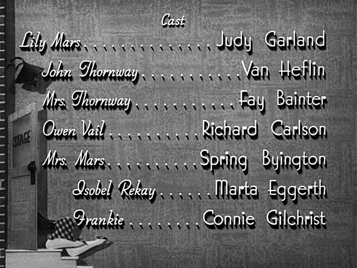
Here’s the title card I’ve created for the next film in Judy Garland’s filmography, Presenting Lily Mars. In the movie, an Indiana teen makes good on Broadway (eventually) thanks to a producer (played by Van Heflin) from her hometown and despite his temperamental leading lady (played by European operetta star Marta Eggerth).

This piece was a hard one to tackle as it’s one of my absolute favorite Garland films and I wanted it to be something really special. I referenced “Presenting” from the main trailer typography but built it out of marquee lights, instead, and a drew an illuminated script for the rest of the title.

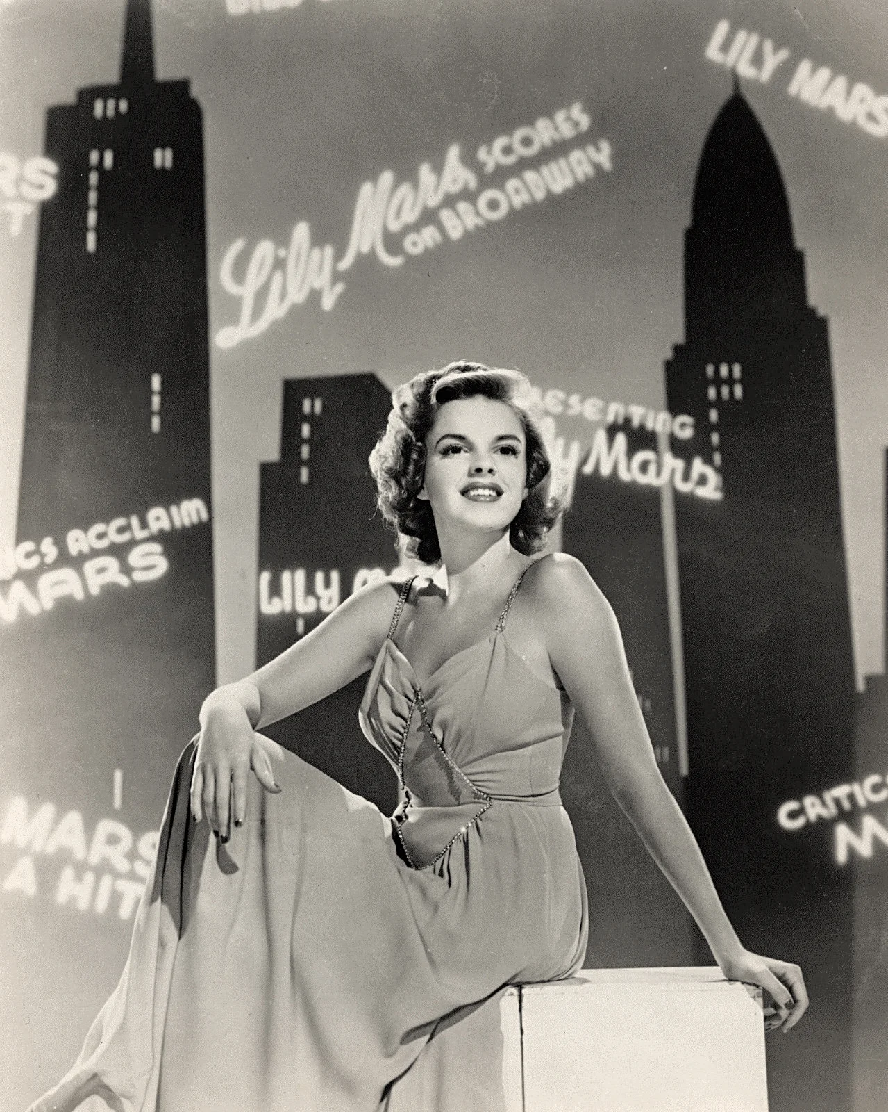
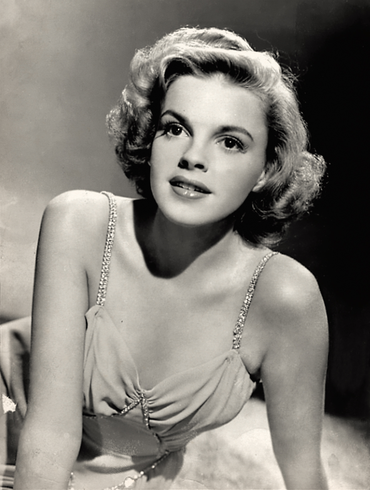
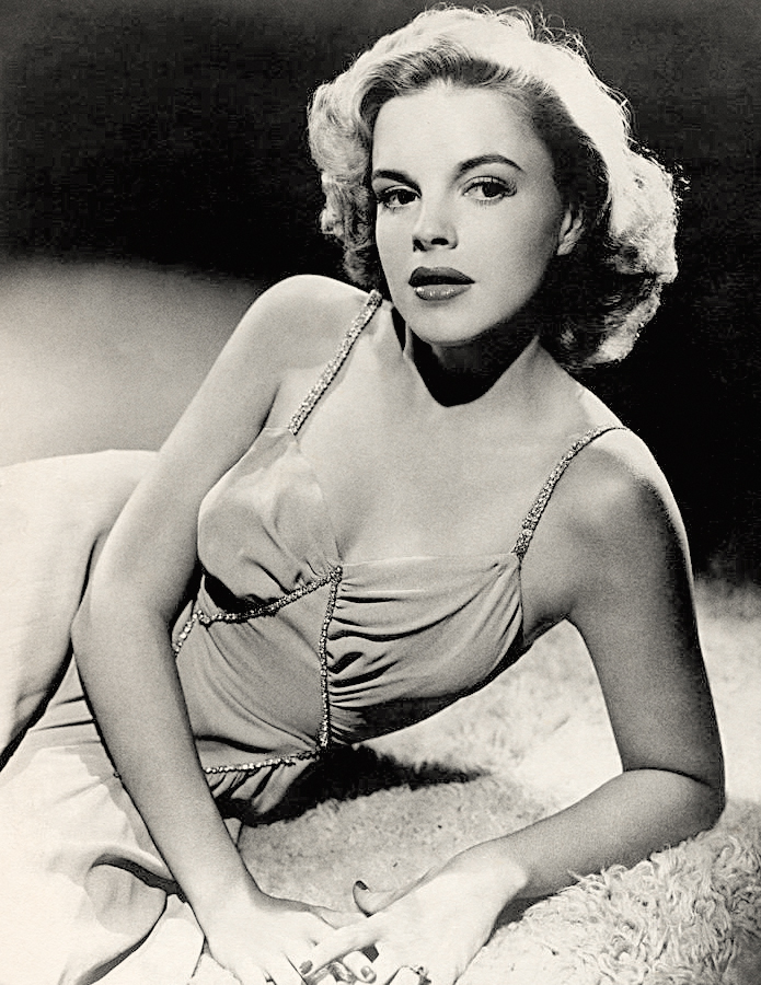
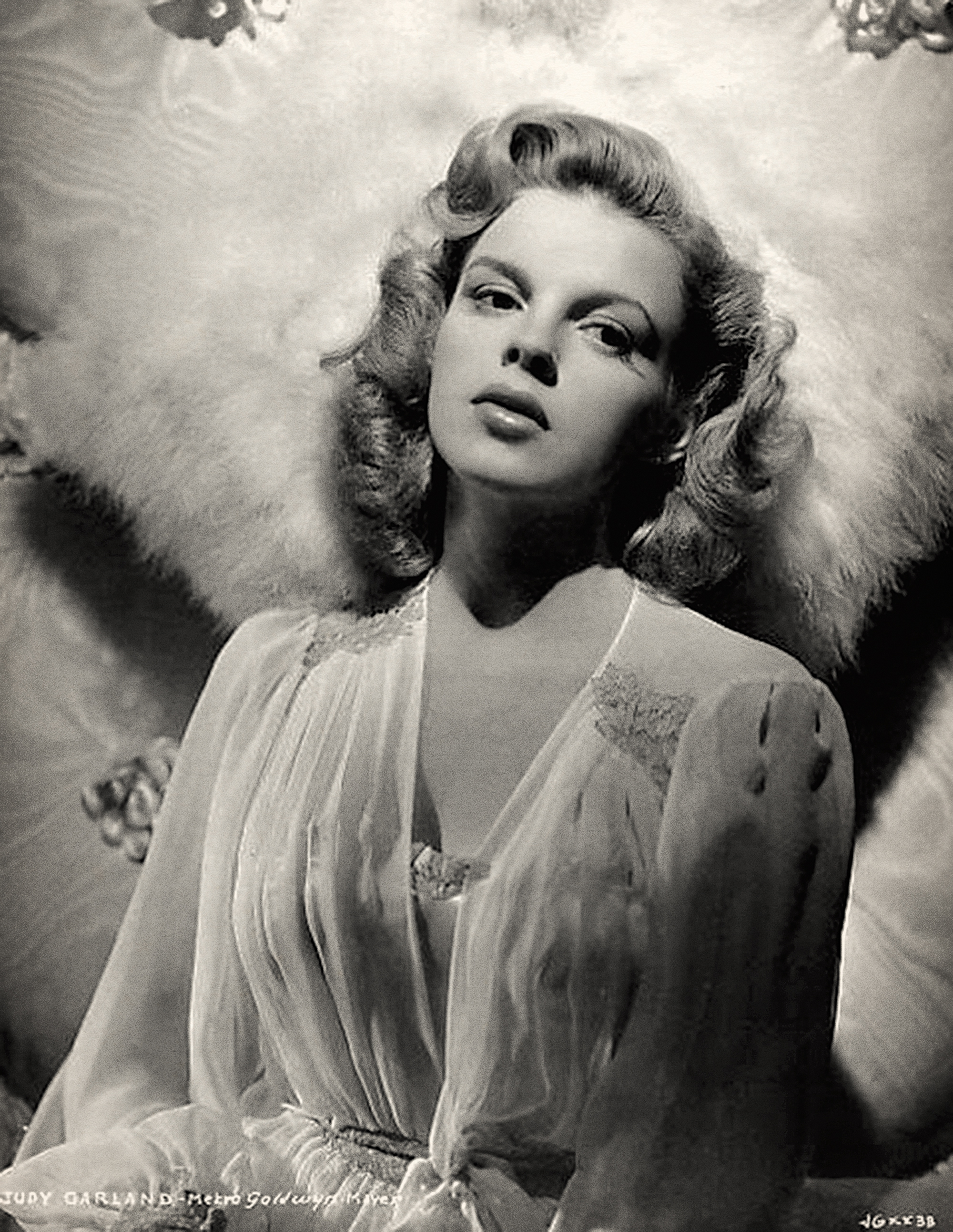
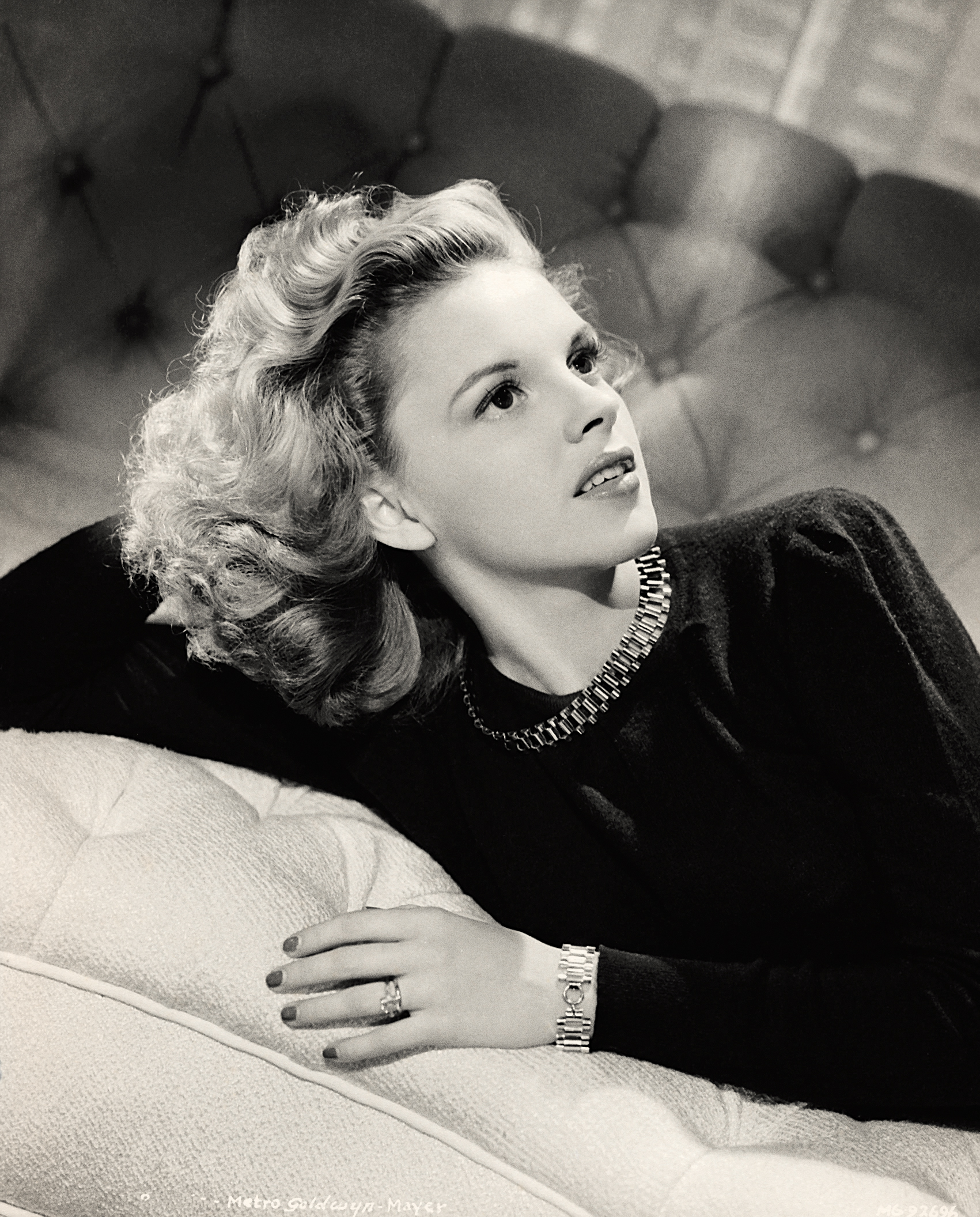
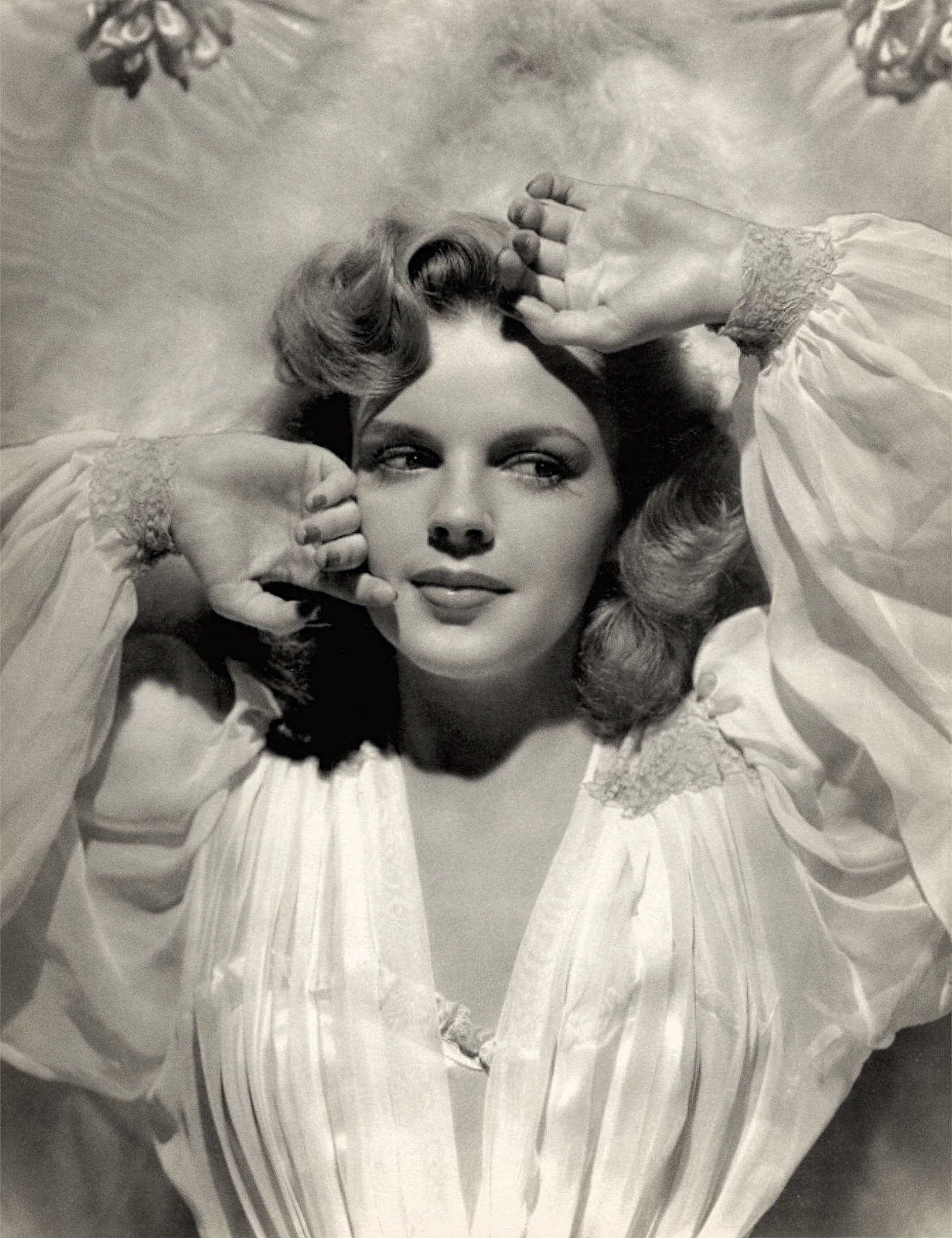
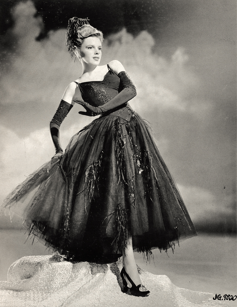
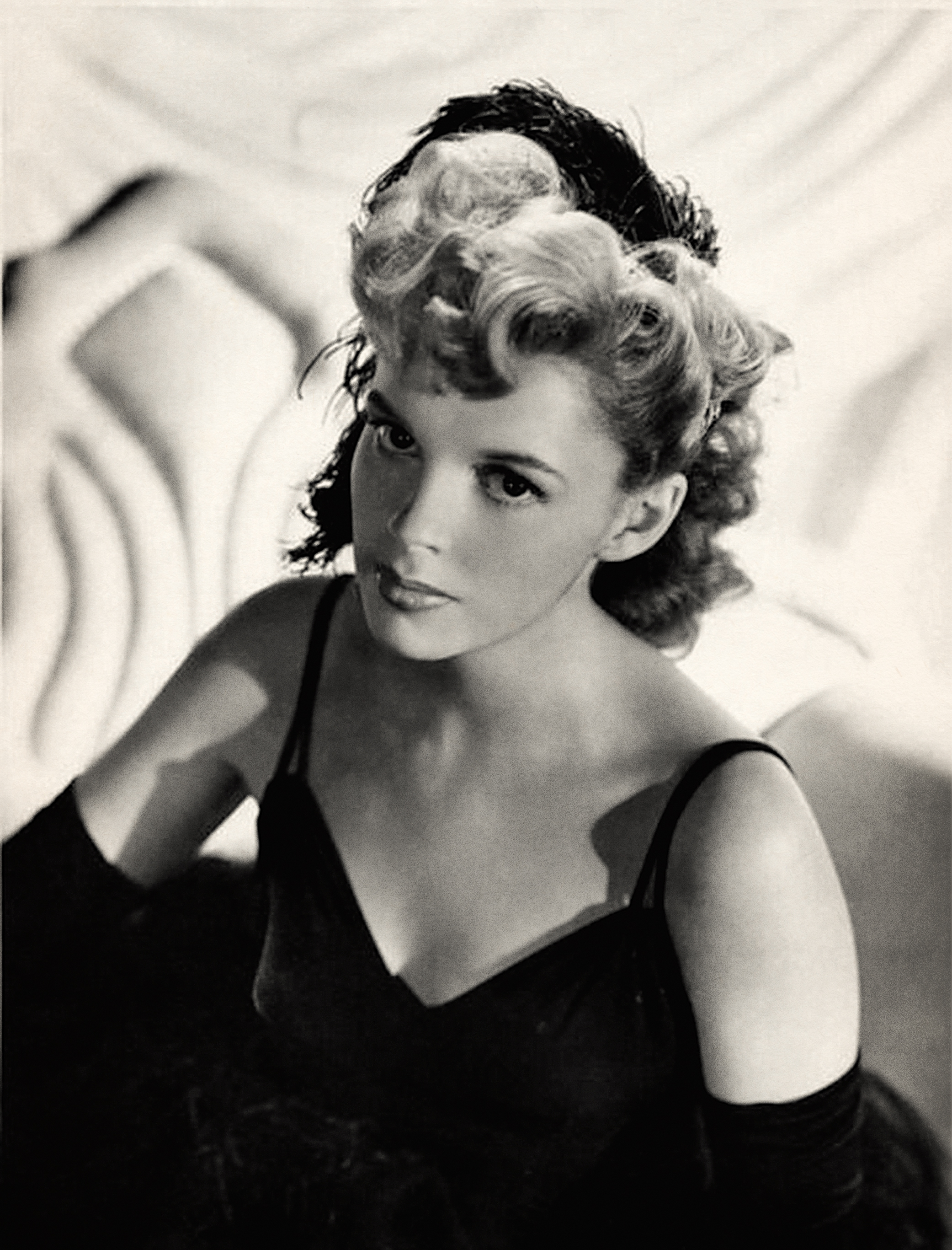
Judy was 19 when she filmed Presenting Lily Mars. Appearing as an adult for the very first time on screen at the end of the picture in the film's grand musical finale number, she was already a divorcee in real life. For the big number she was decked out in an adult evening gown and appeared wearing her hair up for the first time ever on screen.

MGM had intended that the film star Lana Turner but producer Joe Pasternak added musical numbers and thought it was better suited for Judy Garland.

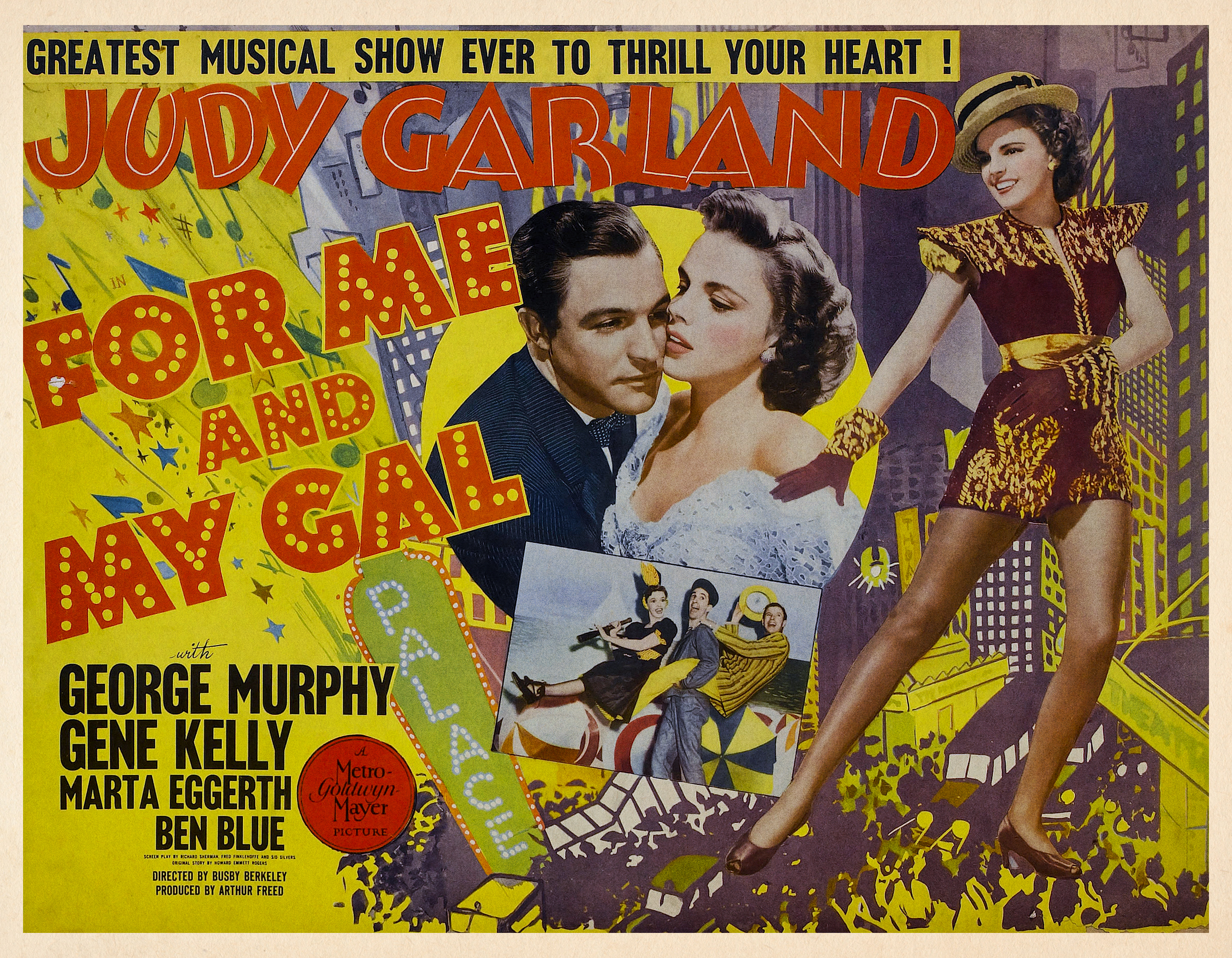
At the time, MGM was working her mercilessly. She was finishing shooting For Me and My Gal, with Gene Kelly, as she started musical rehearsals for Presenting Lily Mars and would start musical numbers for her next film Girl Crazy, while completing the earlier picture.

Per usual, critics hailed her ability to sell a song and her effortless transitions from comic to dramatic scenes. If you only watch a few of her lesser known films, I would highly recommend you give this one a shot.

It’s one of my favorites because Judy has never looked more glamorous, beautiful, and healthy. Despite becoming a divorcee during filming, being over worked, and relying on medications to get through most days, she was a sincere professional which shines through in her heartfelt and heartwarming performance. Her voice is much more mature sounding here than in her “Oz” days which were just a few years prior. This iconic voice would only get stronger and stronger in the coming years.

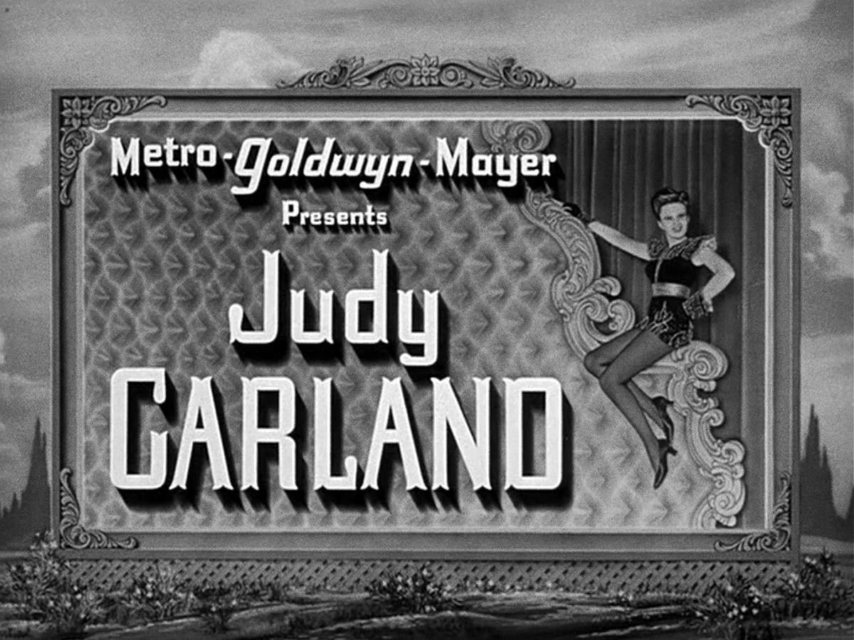
The typography in the trailer is a super bold condensed sans serif that’s perfect for illuminating Broadway. I love the board showing the stars ranking at MGM. It’s a pretty fabulous list to be on.

©RGeroni_PLM_1943Trailer2.jpg
©RGeroni_PLM_1943Trailer3.jpg
©RGeroni_PLM_1943Trailer1.jpg
©RGeroni_PLM_1943Trailer4.jpg
©RGeroni_PLM_1943Trailer5.jpg

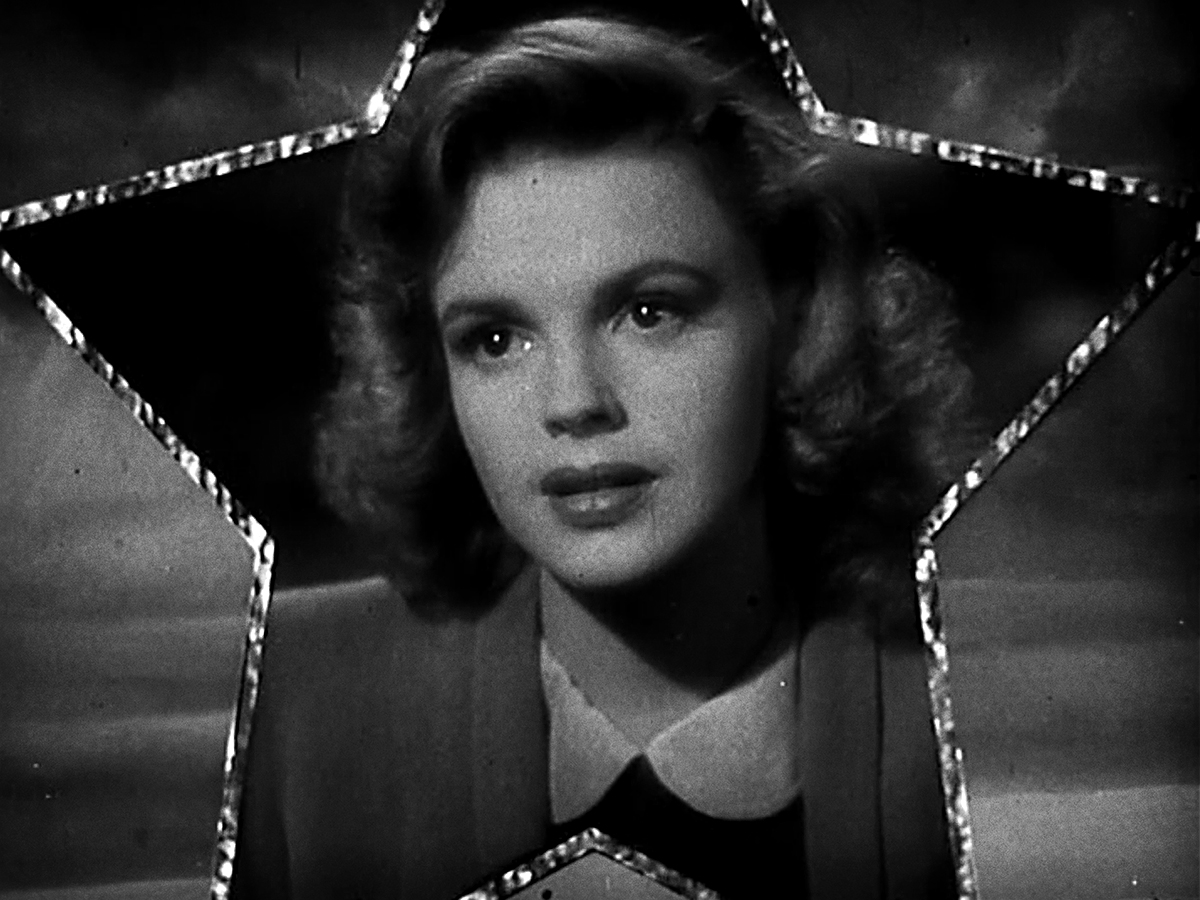
The main title sequence was illustrated by the very talented and iconic illustrator Jacques Kapralik who also created many print ads for the film as well as many other MGM classics I’ll be showing example of when we get there. The treatment features some lovely deco type that very closely resembles what was created for Babes on Broadway.

©RGeroni_PLM_1943Titles1.jpg
©RGeroni_PLM_1943Titles2.jpg
©RGeroni_PLM_1943Titles3.jpg
©RGeroni_PLM_1943Titles4.jpg
©RGeroni_PLM_1943Titles5.jpg
©RGeroni_PLM_1943Titles6.jpg
©RGeroni_PLM_1943Titles7.jpg
©RGeroni_PLM_1943Titles8.jpg

Here is some of the original artwork Kapralik created for the sequence which can be found in the collection of his work at the American Heritage Center at the University of Wyoming’s archive and research center.

©RGeroni_PLM_1943Kapralik_1.jpg
©RGeroni_PLM_1943Kapralik_2.jpg
©RGeroni_PLM_1943Kapralik_3.jpg
©RGeroni_PLM_1943Kapralik_4.jpg
©RGeroni_PLM_1943Kapralik_5.jpg
©RGeroni_PLM_1943Kapralik_6.jpg
©RGeroni_PLM_1943Kapralik_7.jpg
©RGeroni_PLM_1943Kapralik_8.jpg

Here are some lovely pieces of ephemera that showcase many different type solutions for the film’s title.

©RGeroni_PLM_1943Poster1.jpg
©RGeroni_PLM_1943Poster2.jpg

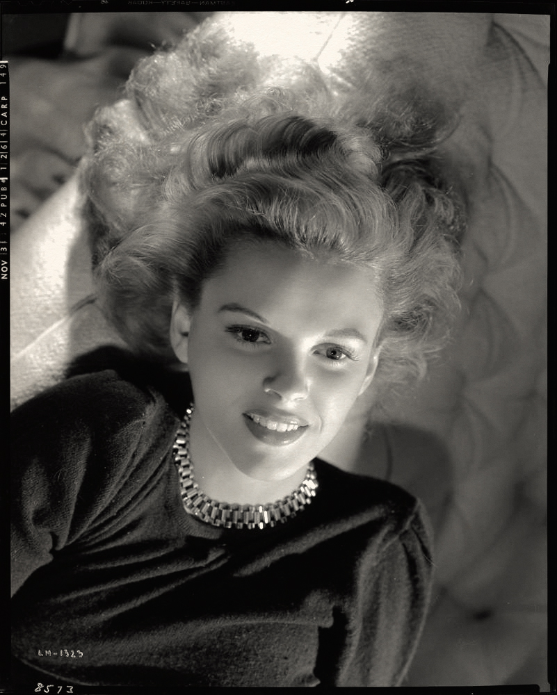
Judy sat for a few glamorous photoshoots made to promote the film. I think this was Judy at her most glamorous and beautiful. You can see hints of Liza Minnelli in those dark eyes and dramatic features!

Here’s the theatrical trailer for the film:

For Me and My Gal • 1942


©RGeroni_FMAMG_1942Title_FINAL.jpg

Here’s a new title card I’ve designed, illustrated, and lettered for the next film in my Judy Garland movie title series!

I didn’t love the Star Wars type from the trailer or the tuscan lettering from the main titles so I decided to reimagine the title card as a super-fancy chromatic wood type poster hanging outside of The Palace Theatre in 1919.

In For Me and My Gal, a group of Vaudevillians encounter romantic challenges and World War I in their hopes of making it big at The Palace Theatre in New York City. It’s Gene Kelly’s very first film and Judy’s first role playing an adult closer to her actual age. She’s not a little kid anymore! This is an underappreciated gem of a musical!

©RGeroni_FMAMG_1942Trailer1.jpg
©RGeroni_FMAMG_1942Trailer2.jpg
©RGeroni_FMAMG_1942Trailer3.jpg

The typography in the trailer is very bold and reminiscent of something from Star Wars.

The main titles have some nice tuscan details.

©RGeroni_FMAMG_1942Titles1.jpg
©RGeroni_FMAMG_1942Titles5.jpg
©RGeroni_FMAMG_1942Titles2.jpg
©RGeroni_FMAMG_1942Titles3.jpg
©RGeroni_FMAMG_1942Titles4.jpg

Here's a gorgeous photo of Judy and Gene:

©RGeroni_FMAMG_1942Photo1.jpg

Here are some lovely pieces of ephemera that showcase many different type solutions for the film’s title.

©RGeroni_FMAMG_1942Poster2.jpg
©RGeroni_FMAMG_1942Magazine1.jpg
©RGeroni_FMAMG_1942Poster1.jpg

Here’s the theatrical trailer for the film:

Love Finds Andy Hardy • 1938


©RGeroni_LFAH_1938Titles_Final.jpg

Next up in my series is Love Finds Andy Hardy released in 1938!

Who will Andy Hardy take to the Christmas Eve dance and will he find a way to get the 18 dollars he needs to buy a car for the occasion!??! You’ll have to watch to find out, haha. Judy was assigned this part at MGM while Arthur Freed was putting together the team that would make her immortal, as Dorothy, in The Wizard of Oz the following year.

©RGeroni_LFAH_1938Titles_1.jpg
©RGeroni_LFAH_1938Titles_2.jpg

The main title type had a fun stitched theme but I really loved the inline deco type used in the theatrical trailer so I created my piece based on that lettering instead. Imagine how big the type in the trailer would have been for audiences. The quiet and tracked-out sans-serif titles of today just seem plain and lethargic in comparison.

©RGeroni_LFAH_1938Trailer_1.jpg
©RGeroni_LFAH_1938Trailer_2.jpg
©RGeroni_LFAH_1938Trailer_3.jpg

The promotional materials created for the film were very delightful and featured some fun type solutions as well:

©RGeroni_LFAH_1938LobbyCard_1.jpg
©RGeroni_LFAH_1938Poster_1.jpg
©RGeroni_LFAH_1938Poster_2.jpg

Check out the original theatrical trailer: